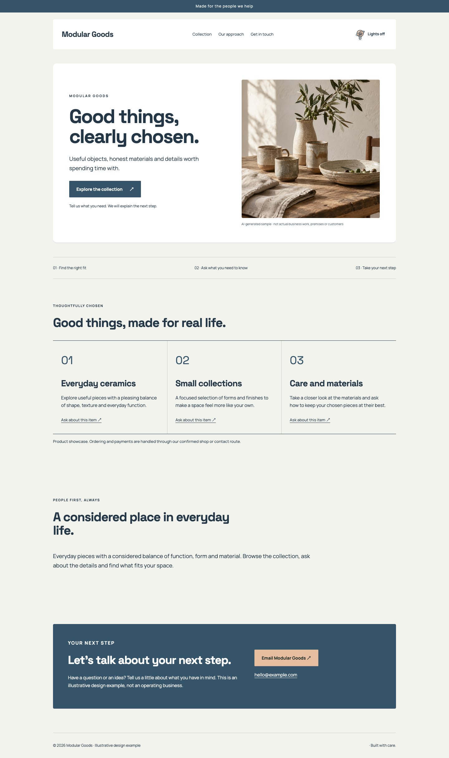
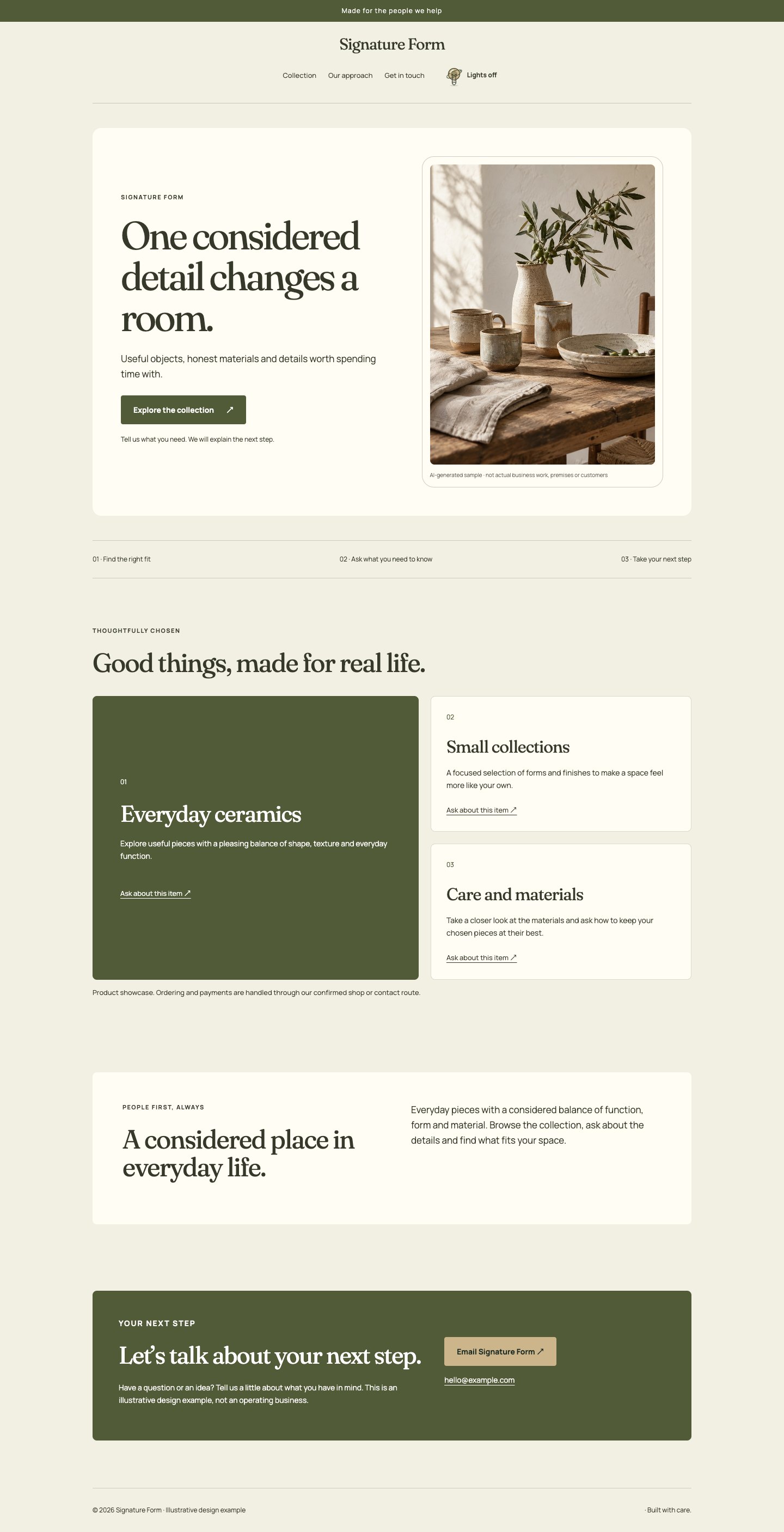
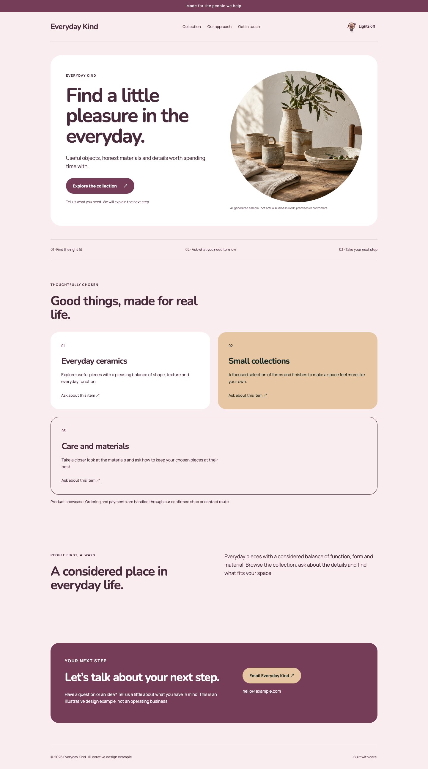
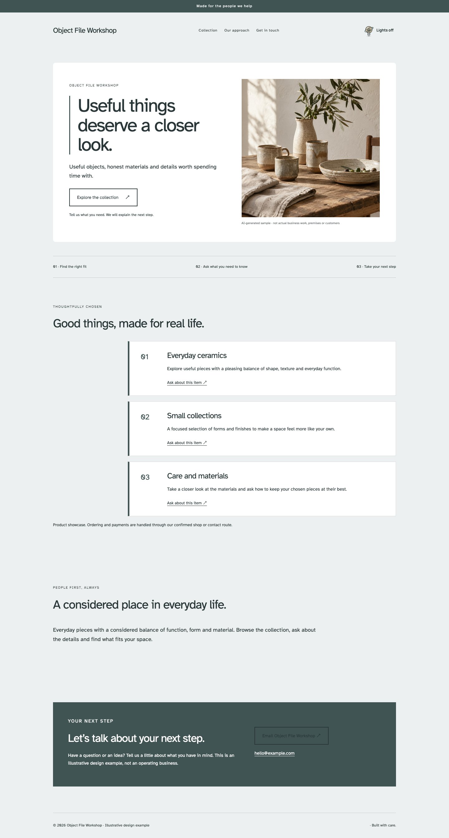
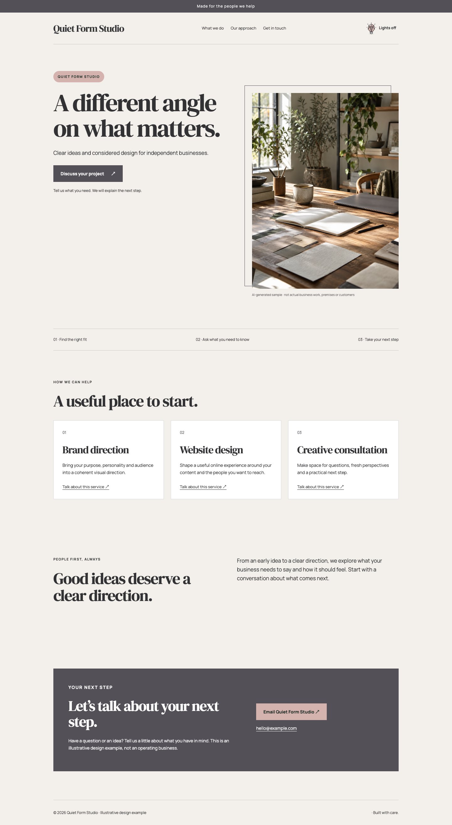
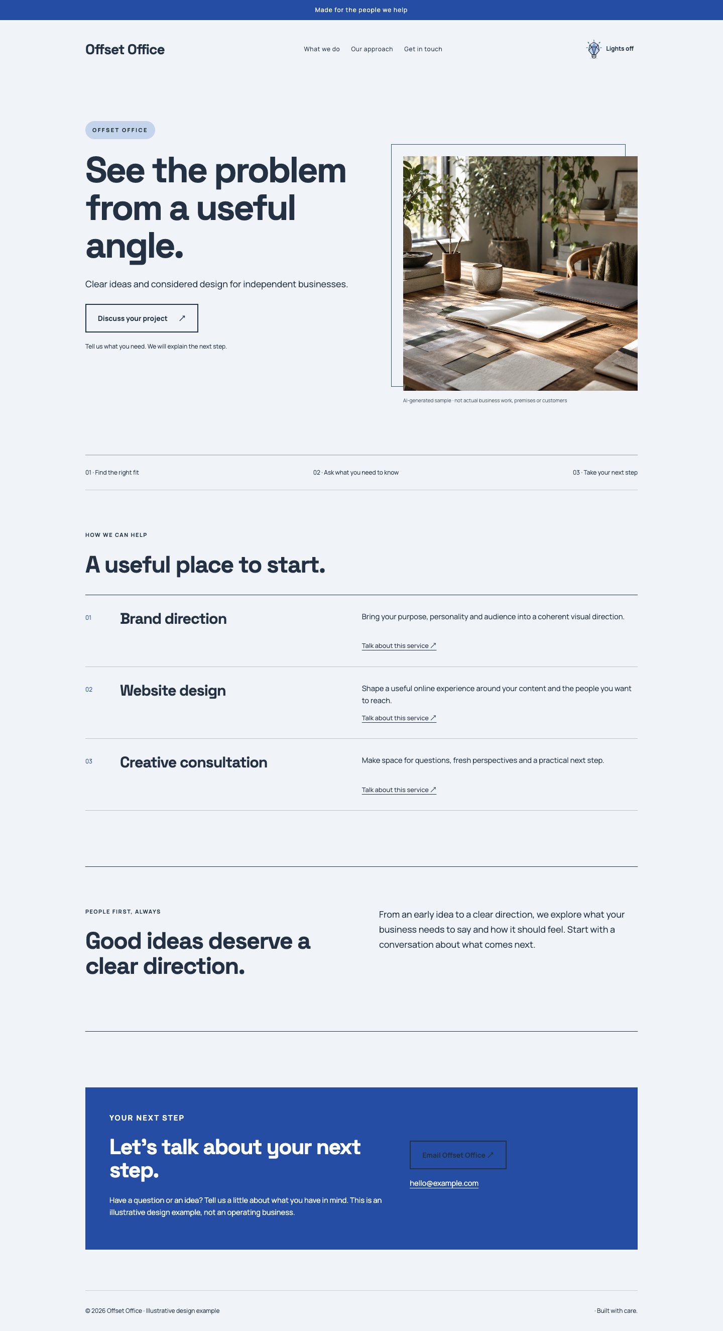
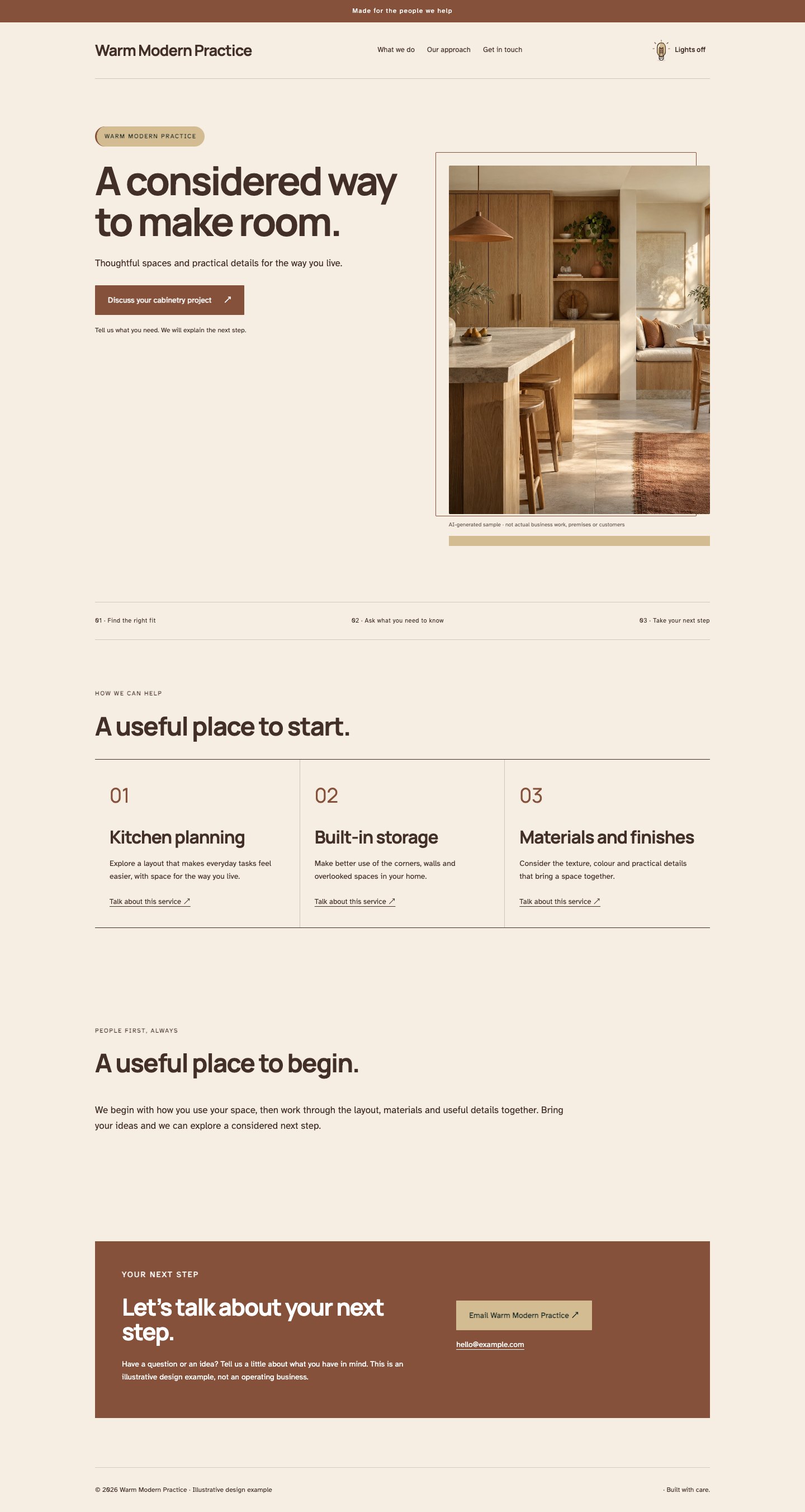
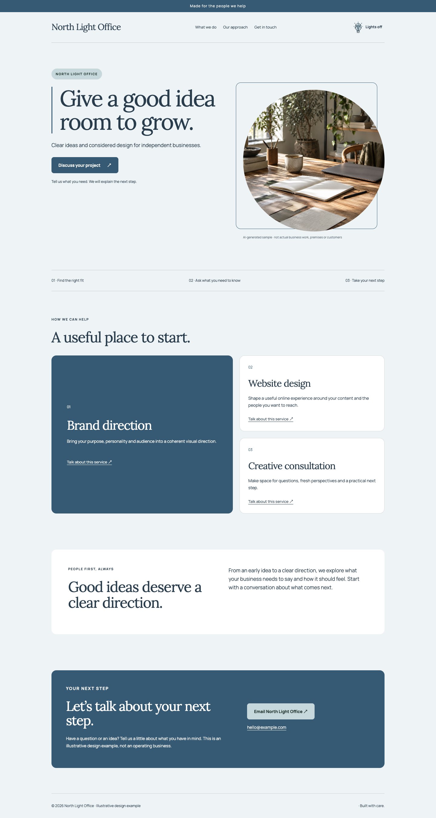
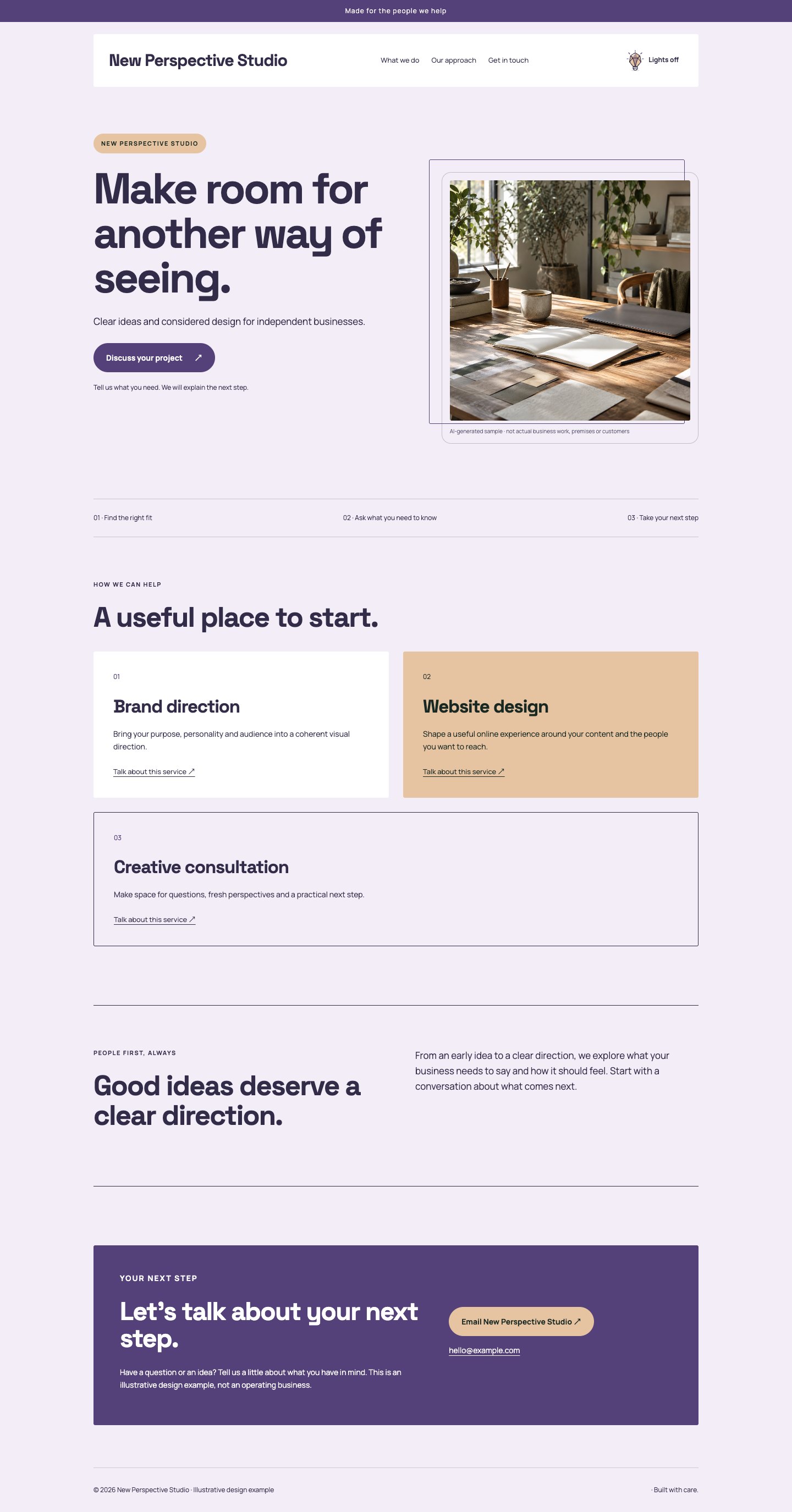
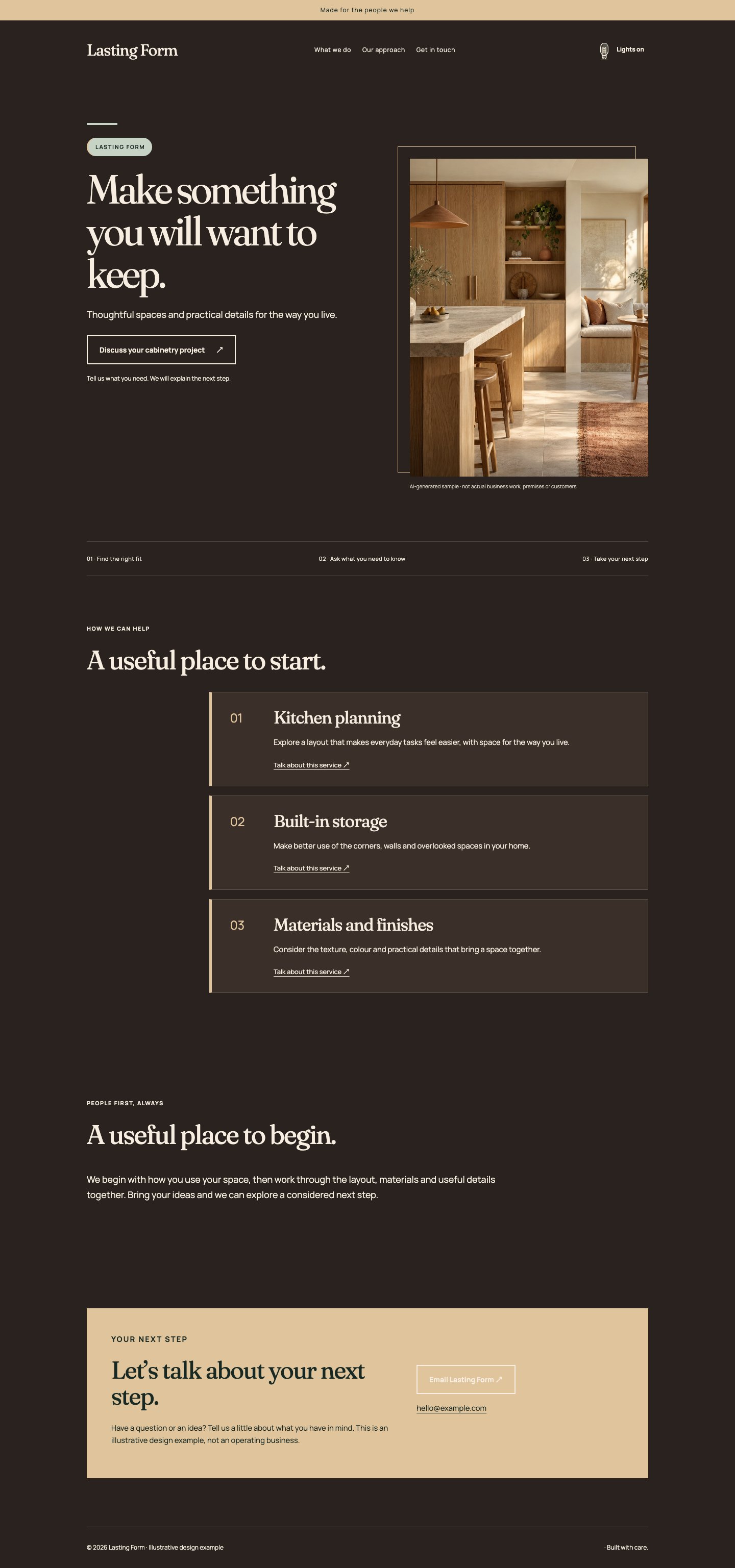
A good website should feel like your business. Explore 42 considered art directions, from quiet and architectural to warm, expressive and full of character.
Compare real website screenshots and the thinking behind each look.
2
Make it yours.
Choose colours, fonts, photos and content in your website studio.
3
Keep room to change.
Restyle your site, a page or a section. Your content stays with you.
THE COLLECTION
Find your kind of different.
These are starting points, with room for your own taste.
Showing all 42 directions
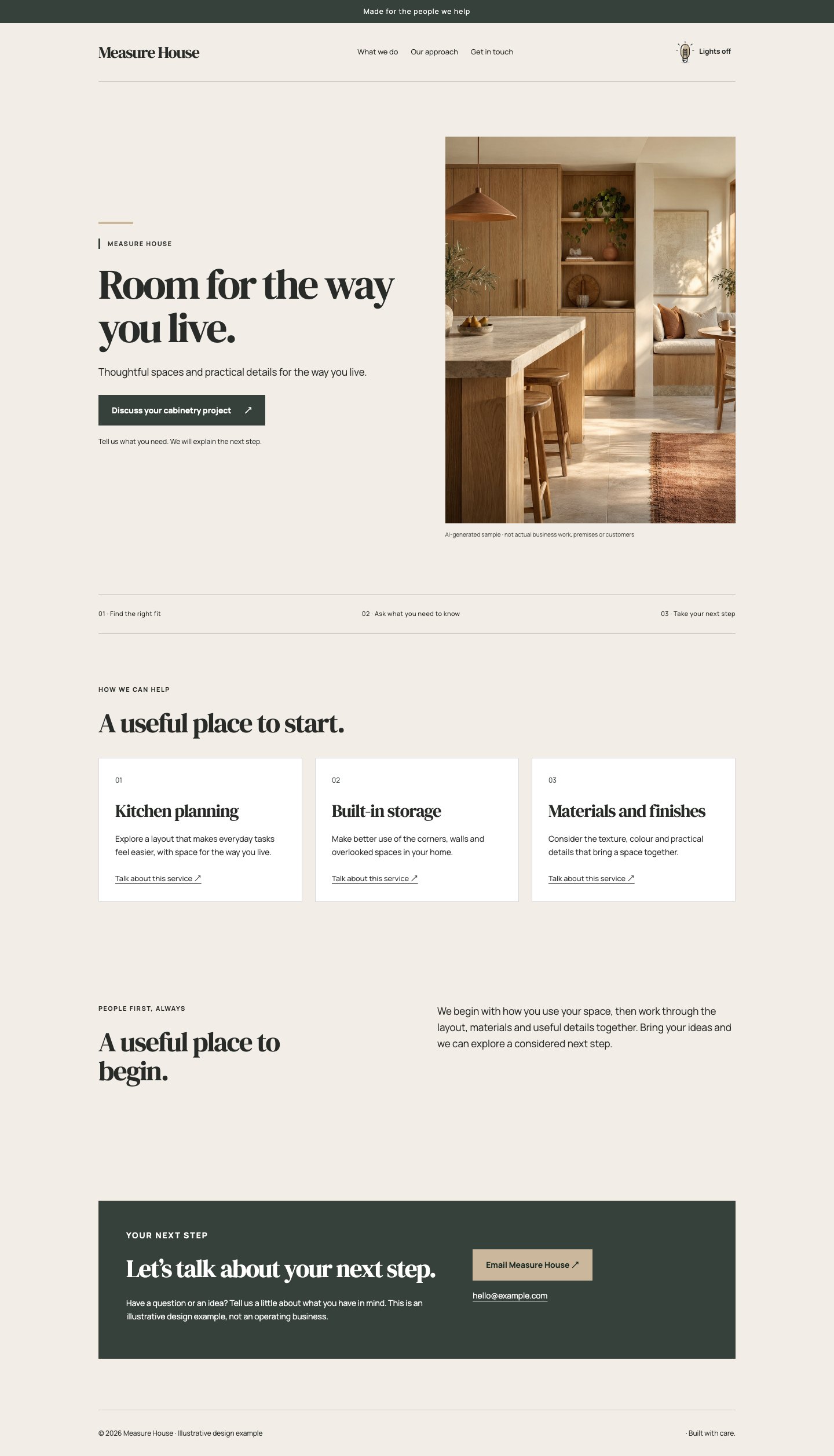
01 / 42Architectural
Stone & Measure
Material warmth. Architectural precision.
Why this direction works
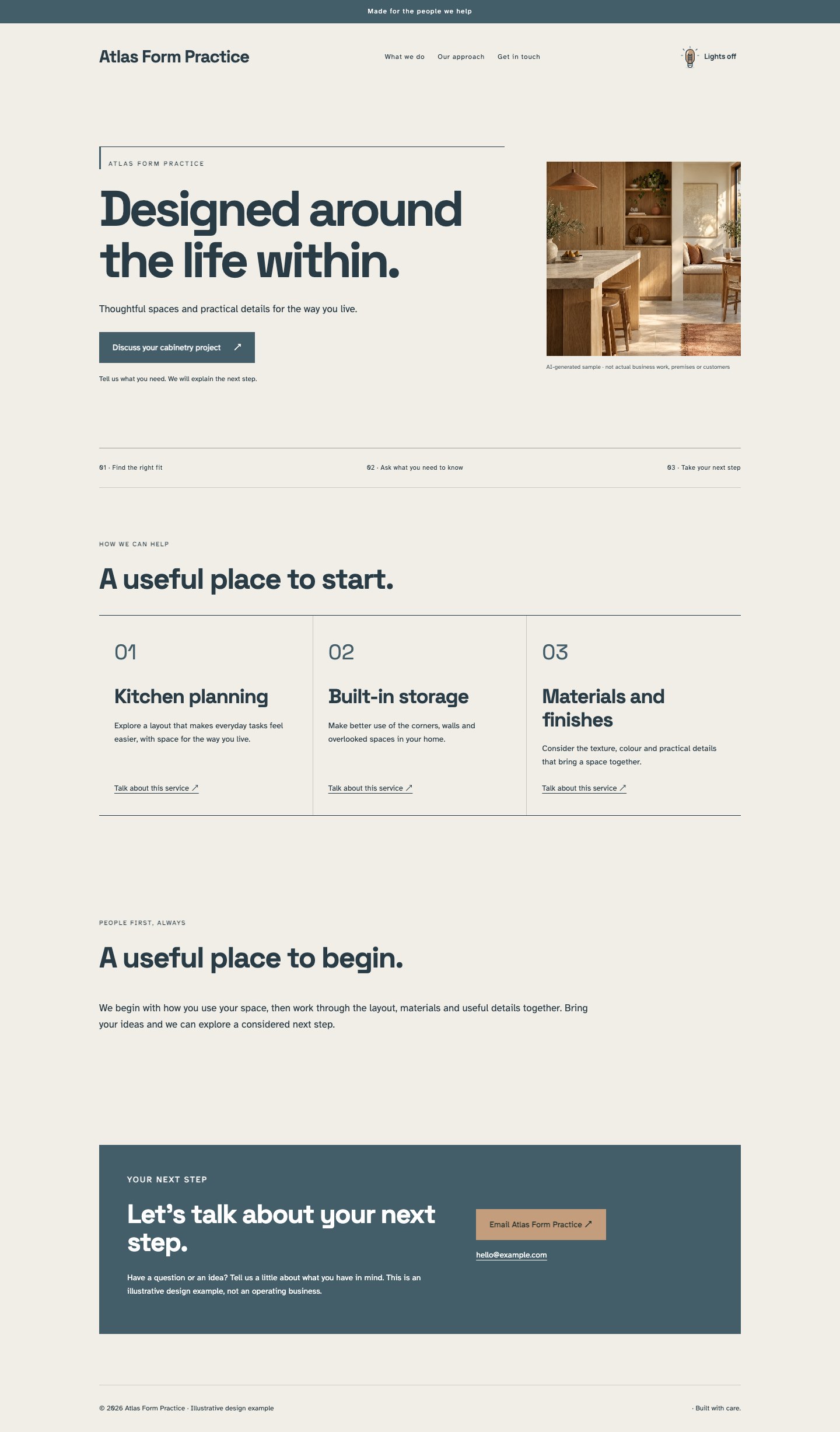
A measured split composition pairs a substantial serif headline with a tall photograph and quietly ruled navigation. Limestone paper, warm white panels and deep charcoal give cabinetry, interiors and specialist services a tactile setting. The service grid remains practical and easy to scan. Generous margins create room for material photography, while square corners and small labels keep the presentation disciplined rather than decorative.
The thinking behind it
The balance of warm colour and strict geometry suggests care without relying on luxury clichés. A conventional service grid makes the offer easy to understand after the expressive opening. It works best with strong material photographs and concise headings; cluttered imagery or long promotional slogans dilute its calm.
A natural fit for: Interiors, Cabinet makers, Architecture practices.
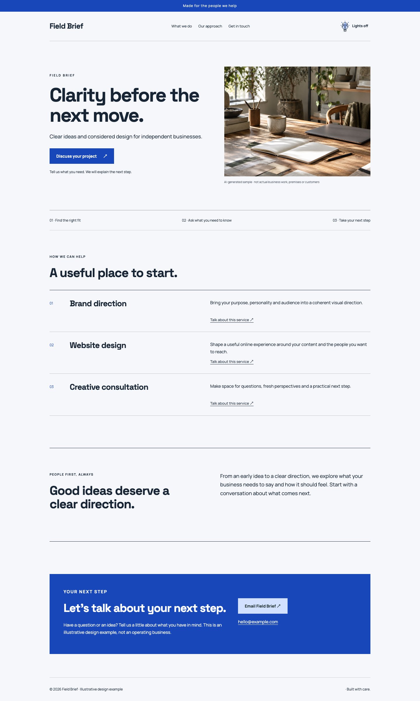
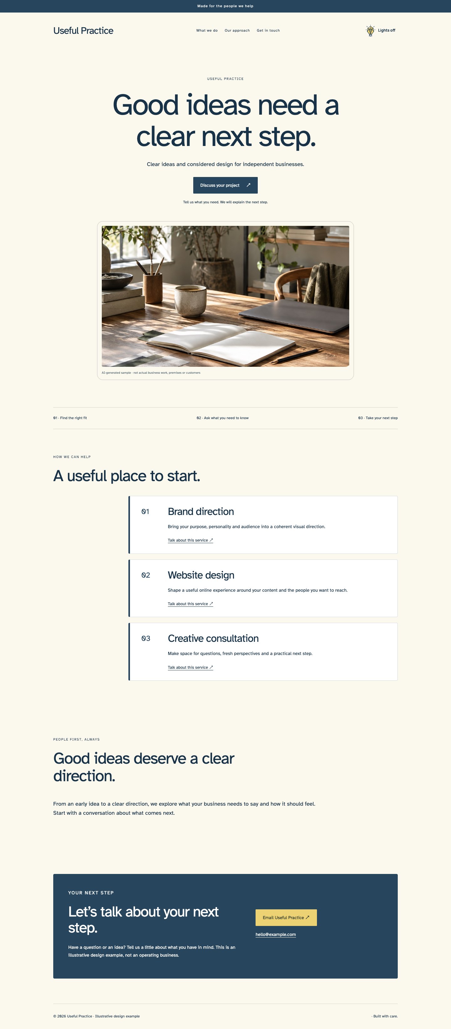
Bright paper and a precise cobalt accent frame a confident, text-led split opening. Compact sans typography gives the page a contemporary consultancy character, while a ruled offer list replaces decorative cards with a readable sequence. The photograph supplies a human or material counterpoint. A bordered introduction and restrained navigation make the entire page feel like a well-edited project brief with a clear next action.
The thinking behind it
Blue establishes a strong visual anchor while generous white space keeps information approachable. Numbered list-like offers help visitors compare services without deciphering a complex interface. The design suits businesses with a specific process to explain; use short service descriptions and avoid turning every line into a highlighted callout.
A natural fit for: Consultants, Design studios, Project services.
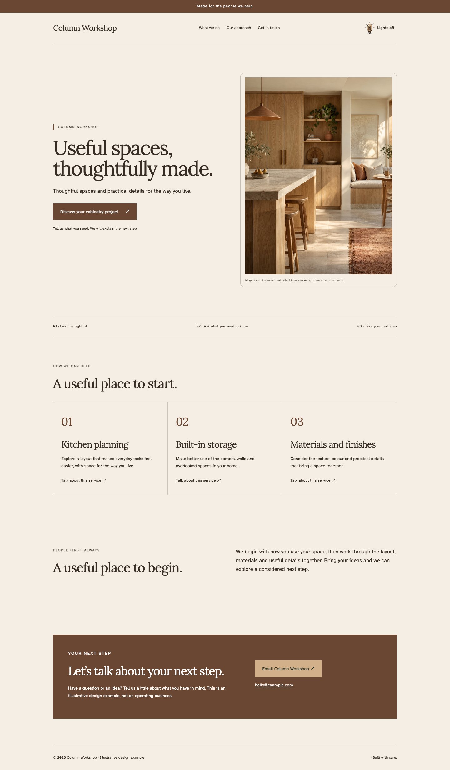
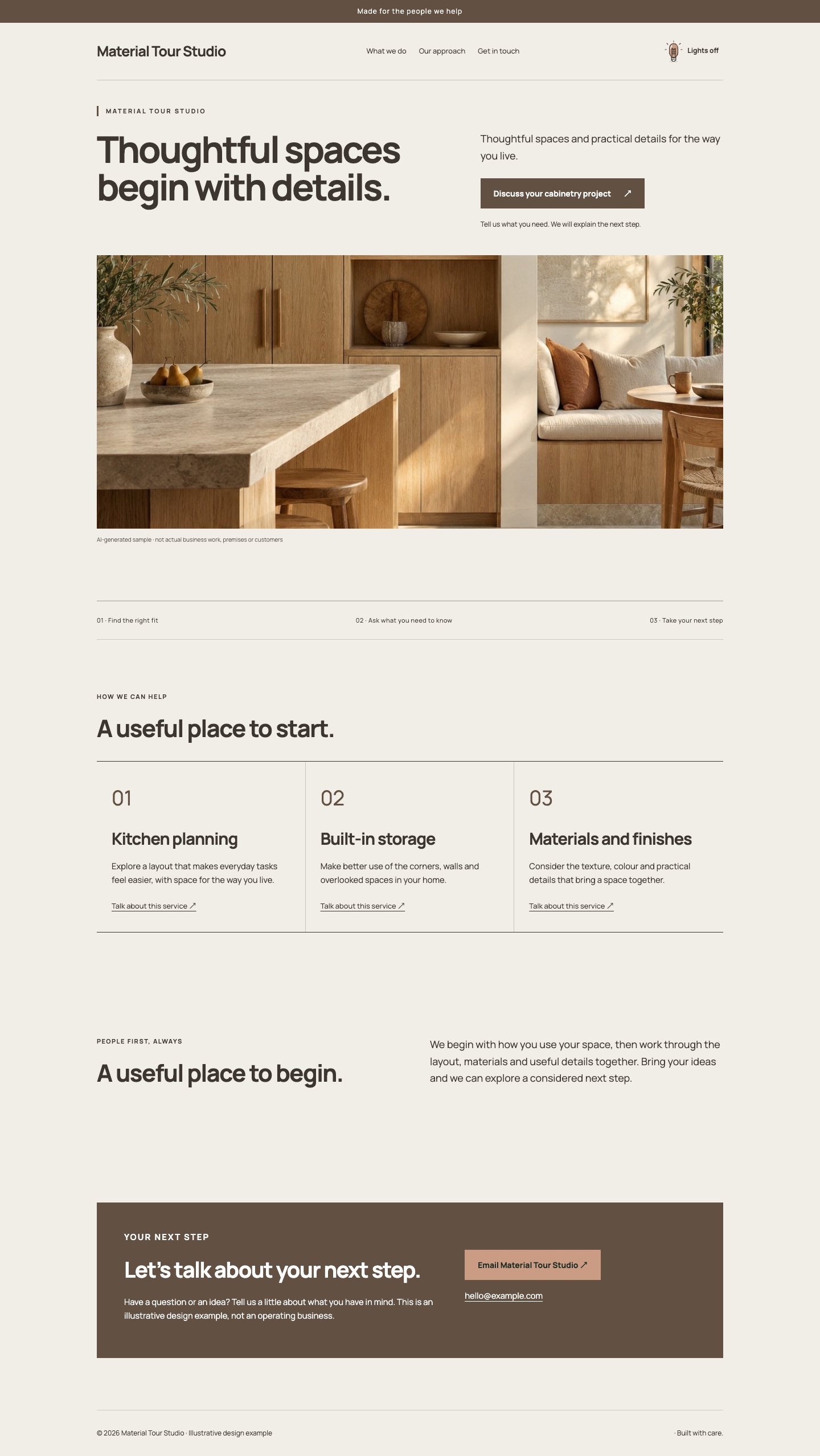
Oak, parchment and a deep brown ink build a warm architectural composition with distinct vertical rhythms. The opening uses an evenly weighted photograph and headline; column-based offers then echo the proportions of shelving or joinery. A narrow serif title adds character without overwhelming practical information. The layout keeps surfaces flat, borders fine and spacing deliberate so the craft and materials carry the personality.
The thinking behind it
Repeated columns connect the visual system to the business of making and fitting things. Warm neutrals allow wood and natural finishes to remain the most vivid elements. It suits considered craft portfolios; service titles should be reasonably similar in length so the column rhythm feels intentional on desktop.
A natural fit for: Joinery, Furniture makers, Renovation specialists.
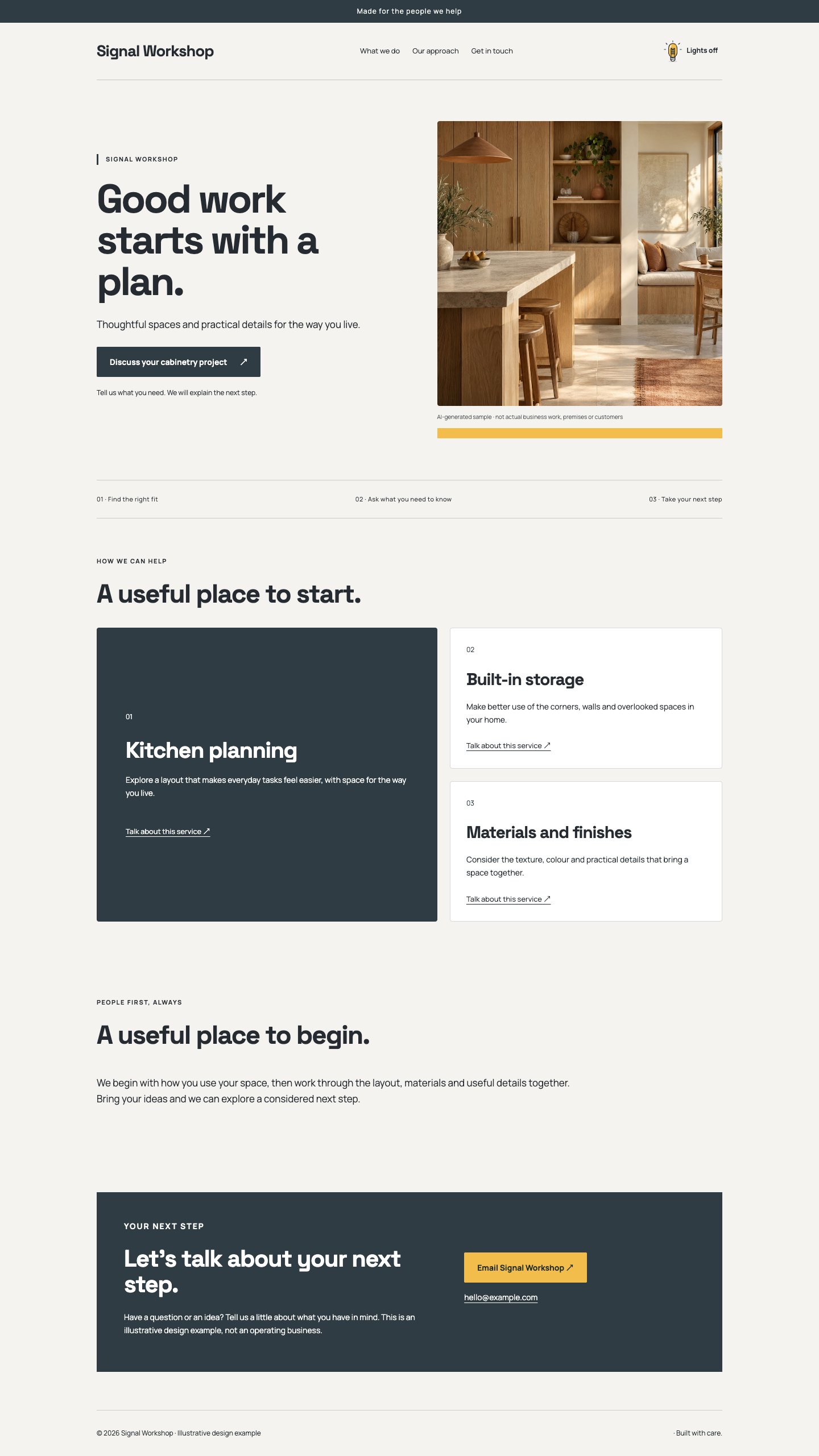
A charcoal and warm-white system uses a sharp amber accent to highlight the next step. The split hero is direct and unfussy, with a dominant offer panel establishing the primary service before supporting options. Bold geometric headings, visible structure and compact spacing produce a capable workshop character. Photography remains rectangular and factual, making this a strong starting point for businesses whose work needs explanation.
The thinking behind it
One featured offer creates a useful priority instead of treating every service as equally important. Amber brings energy to an otherwise restrained system and gives buttons a distinct destination. Choose this when one service deserves the lead; avoid filling the feature panel with unrelated announcements or exaggerated promises.
A natural fit for: Repair services, Skilled trades, Technical studios.
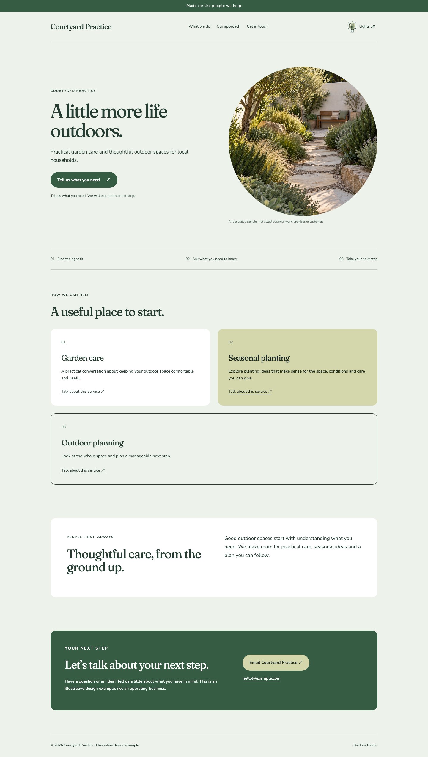
An airy split hero, a soft square image and a tiled service arrangement create an inviting garden-facing layout. Sage-tinted paper and pale stone surfaces soften the grid, while a deep green ink keeps the page readable. Rounded details are used sparingly rather than everywhere. The introduction is presented as a quiet inset, giving the page a conversational pause after the more structured services.
The thinking behind it
The grid makes a range of practical services approachable without sacrificing a sense of order. Soft edges and natural colours complement plant photography while retaining strong text contrast. It works well for gardens and sustainable home services, provided the copy describes real work instead of relying on vague green claims.
A natural fit for: Garden services, Landscape planning, Home improvement.
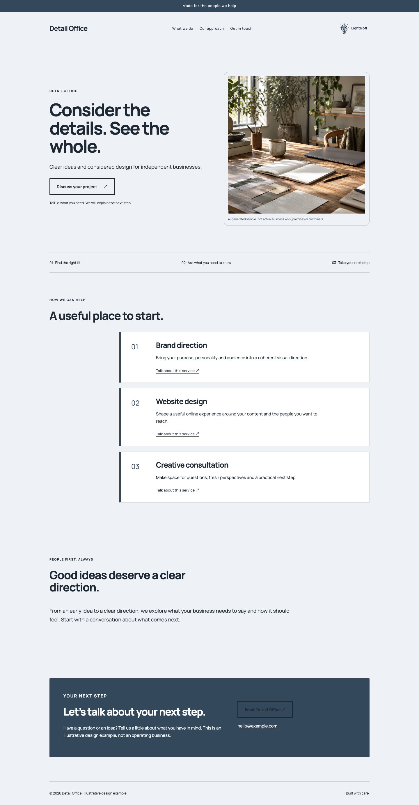
A monochrome split hero and stacked offers establish a rigorous, almost technical presentation. Large dark headings sit against cool paper, with subtle blue-grey surfaces creating hierarchy instead of ornament. The header stays minimal and the photograph receives a clean frame. A wide story section lets useful explanation breathe, producing a page that feels deliberate, legible and reassuringly straightforward across service-led business types.
The thinking behind it
Stacked offers accommodate more explanatory copy than a dense grid and preserve a clear reading order on smaller screens. Restrained colour puts the emphasis on content and imagery. This direction suits complex services, though it needs precise copy and a strong photograph to avoid feeling like an unfinished document.
A natural fit for: Technical consultants, Professional services, Specialist makers.
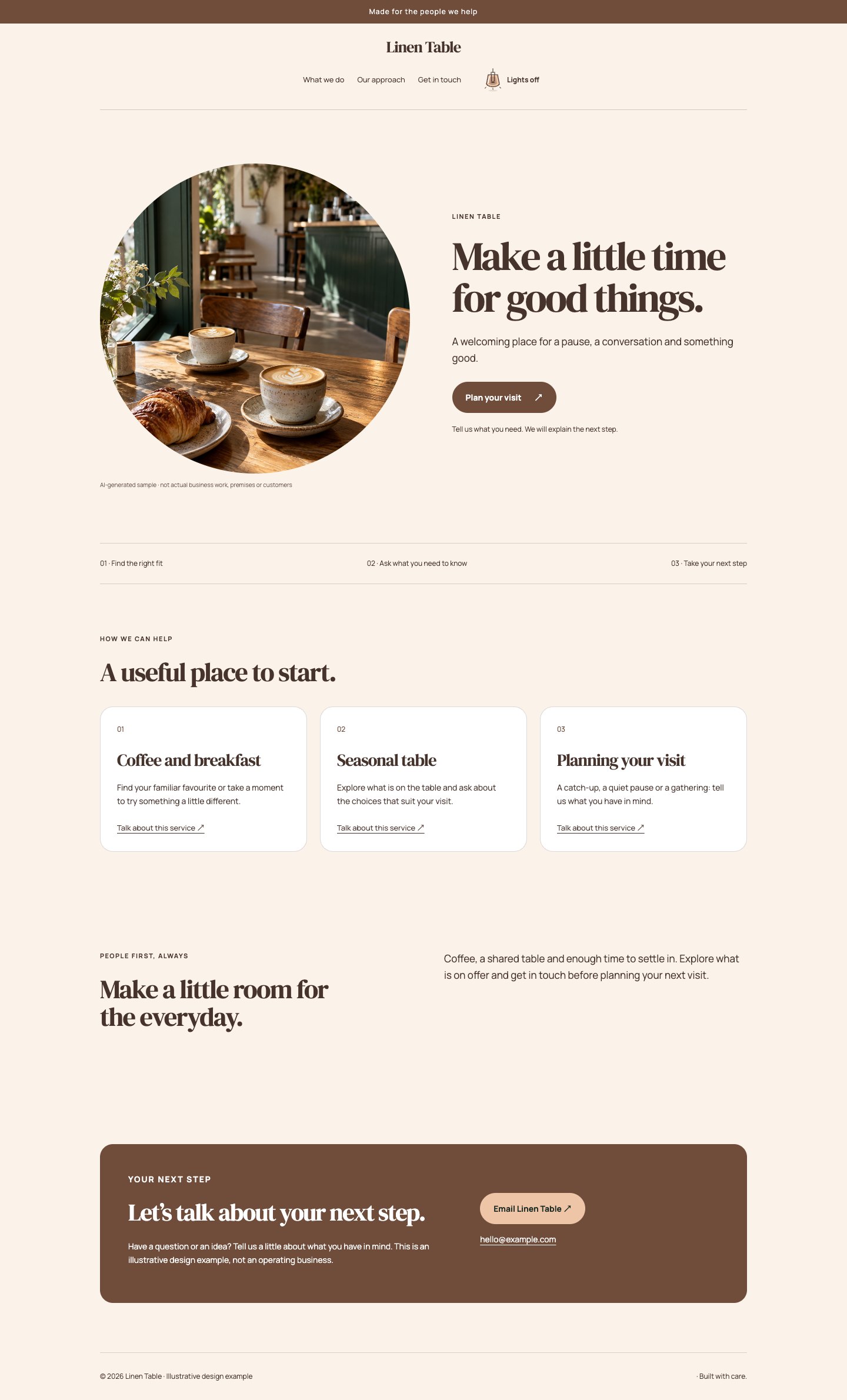
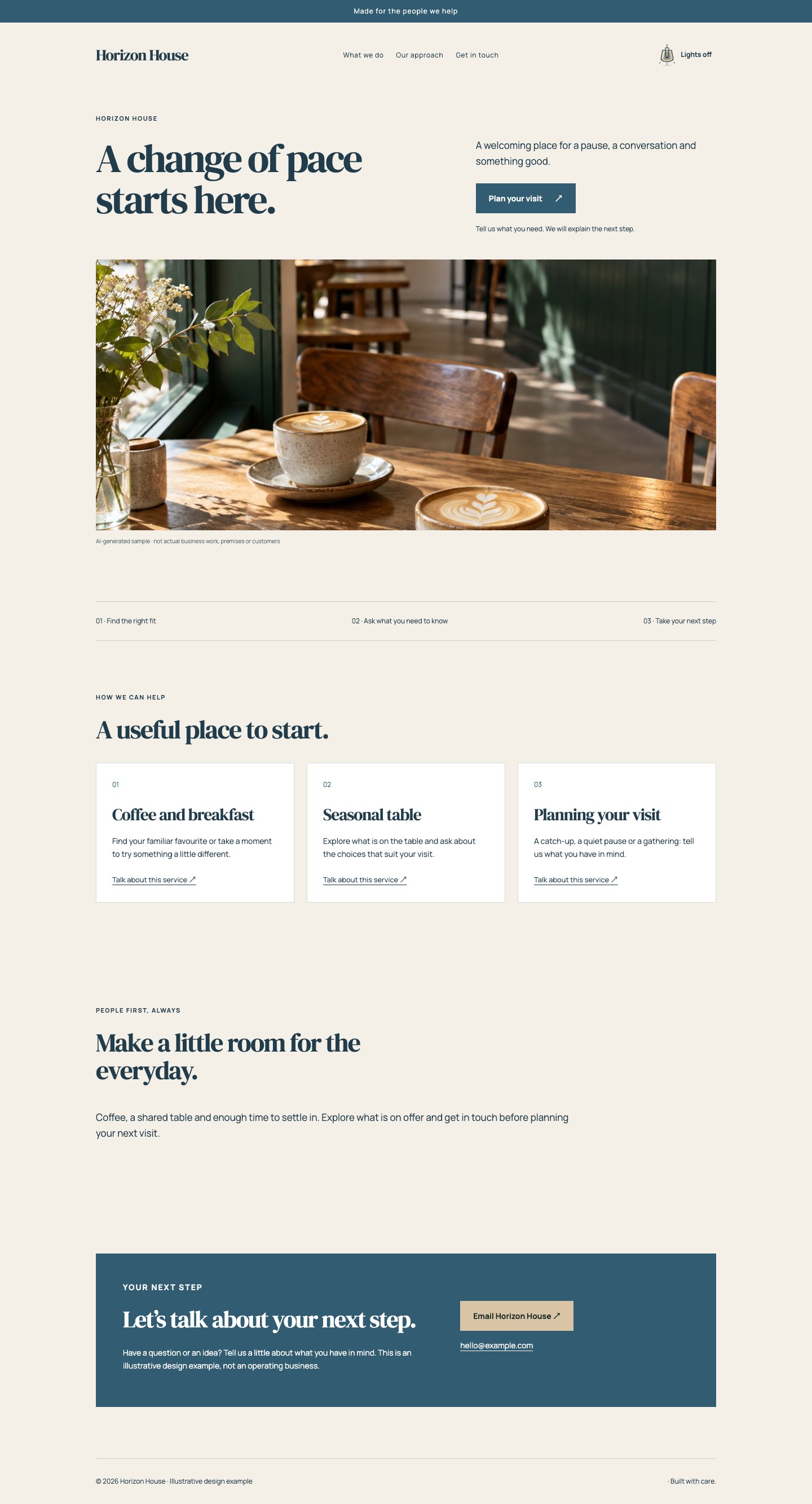
A photograph-first opening leads into soft ivory, espresso and muted peach. Rounded image corners and a classic serif headline make the page feel hospitable, while an uncomplicated three-part offer grid answers the practical questions. A centred header gives the opening a settled rhythm. This is a warm editorial treatment for everyday places and experiences, with enough restraint to avoid the appearance of a themed restaurant poster.
The thinking behind it
Putting the photograph first establishes atmosphere before asking visitors to read. Familiar grid structure then makes the experience or menu categories easy to browse. Warm neutrals support food and interior photography, but the page still needs accurate opening, booking and access details to turn that atmosphere into a useful visit.
A natural fit for: Cafés, Small accommodation, Local experiences.
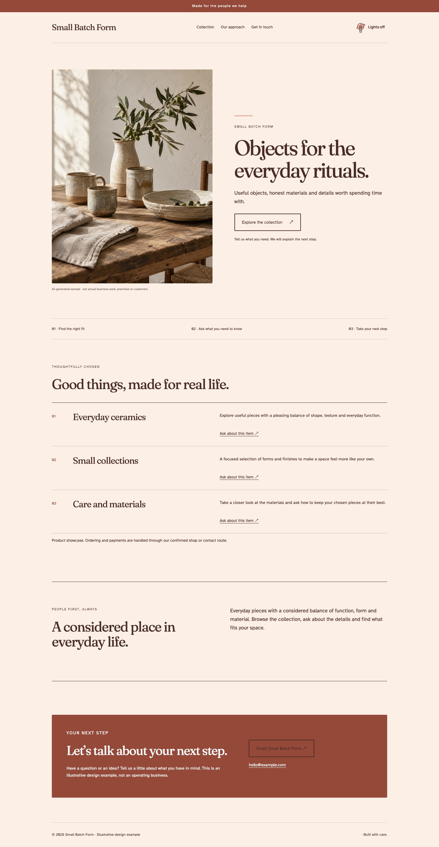
A reversed hero places the maker’s photograph before a warm, characterful headline. Clay red, cream and dark brown give the page a tactile identity, while a ruled offer list recalls a small studio catalogue. The approach section is framed with a simple border, letting the maker’s story sit comfortably beside useful product information. Typography feels personal and literary, but navigation and actions remain clear and direct.
The thinking behind it
The list format gives each range or service its own line of attention without pretending every item needs a promotional card. Clay accents complement handmade materials. This works well for a small, focused collection; a large inventory will still need a dedicated shop with product filtering, stock and checkout.
A natural fit for: Ceramic artists, Small makers, Craft workshops.
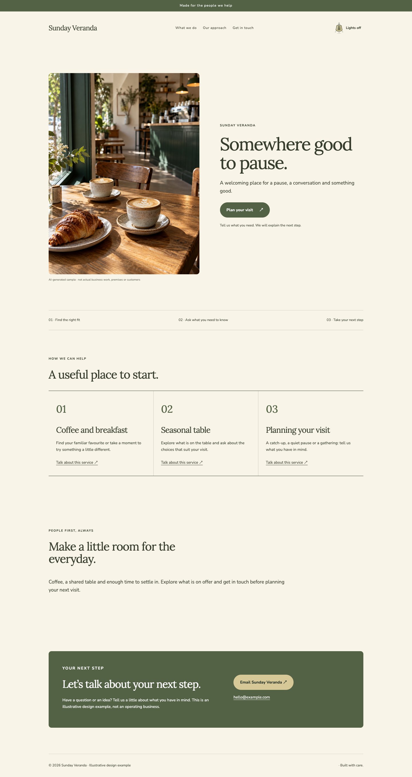
Light cream and muted olive give a photograph-led opening a relaxed, sunny character. Vertical offer columns introduce different ways to visit, take part or ask for help. A tall rectangular photograph with gently softened corners gives the opening a clear, generous view of the setting. The wide story section, open spacing and readable body type keep the page welcoming to people who prefer a calm, unhurried experience.
The thinking behind it
The portrait photograph gives the setting room to breathe while the underlying column layout remains conventional and easy to understand. Olive works naturally with café and garden imagery. This direction needs enough white space to feel relaxed; too many badges, price stickers or competing calls to action would undo the intended rhythm.
A natural fit for: Neighbourhood cafés, Gathering spaces, Slow travel.
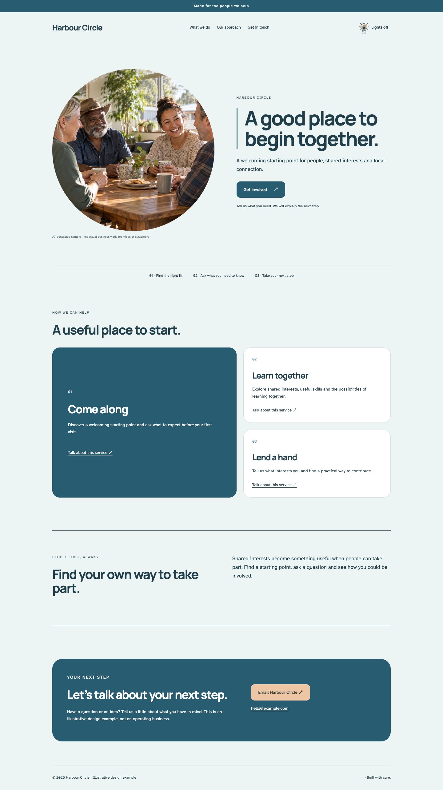
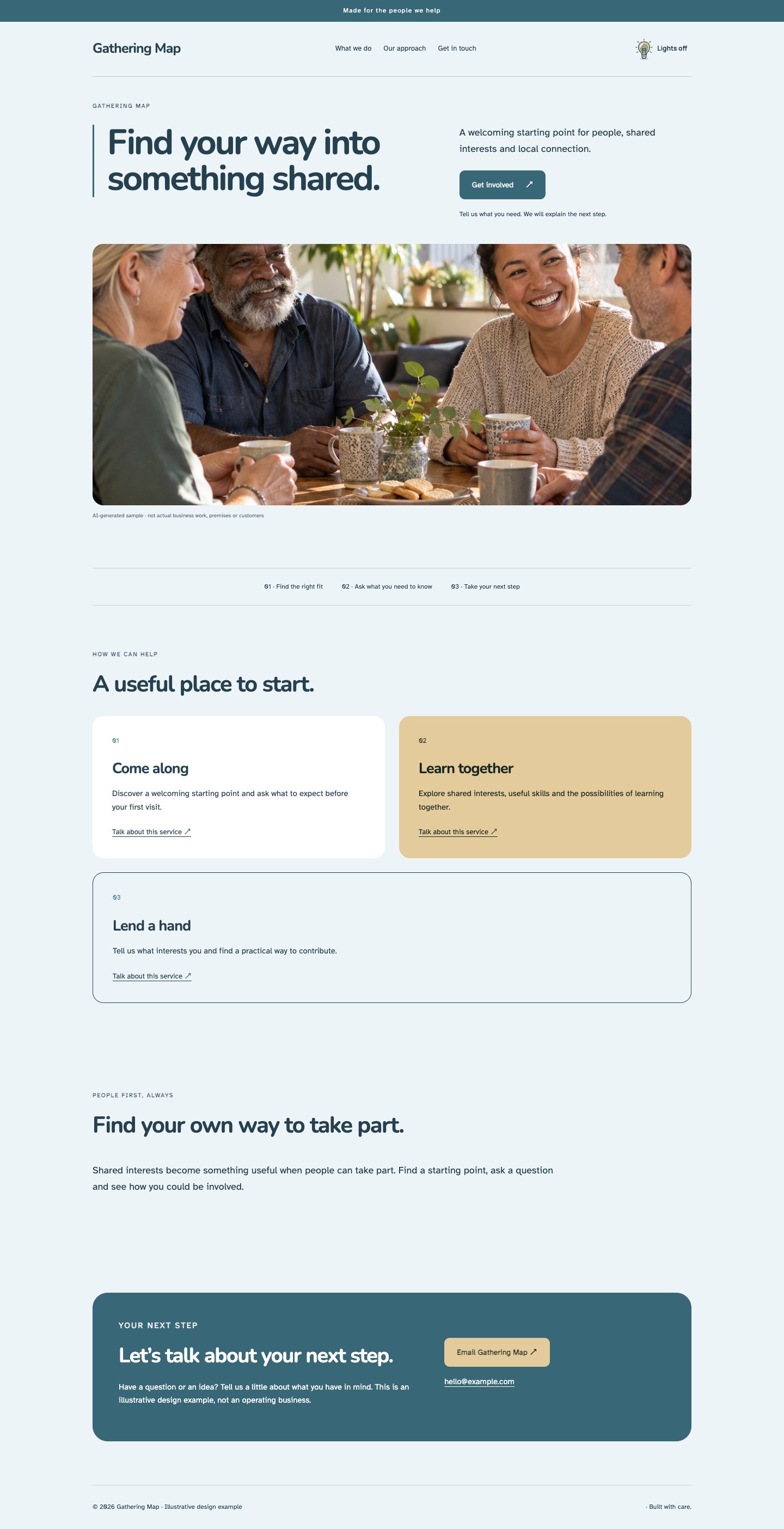
Sea-glass paper, navy ink and a pale apricot highlight create a fresh alternative to familiar corporate blue. The photograph leads the opening, while one featured service makes the first practical step obvious. Gently rounded panels and a bordered introduction add structure without a hard edge. The result suits welcoming local organisations and service businesses that want warmth alongside an organised, confident presentation.
The thinking behind it
A clear lead service reduces the effort of choosing where to begin, especially for first-time visitors. Navy maintains readable contrast and apricot guides attention without shouting. Use the featured position for the genuinely useful starting point, rather than an upsell that distracts from the visitor’s immediate question.
A natural fit for: Local organisations, Home support, Community services.
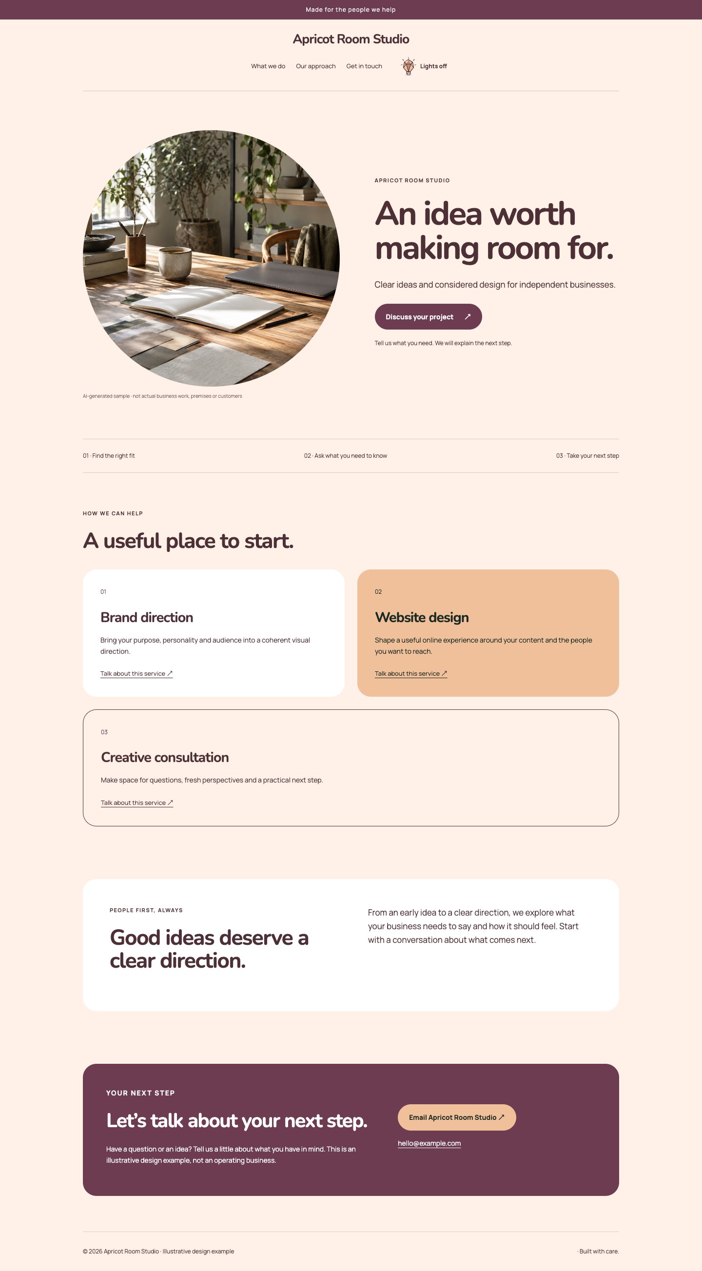
A pale apricot canvas brings gentle warmth to a clean, photograph-first layout. Rounded tiles separate the offers, allowing workshops, appointments or creative services to sit side by side without visual clutter. The headline uses a friendly but substantial sans face; body text stays open and readable. An inset story panel introduces the people or process behind the work, while plum-brown actions provide a clear anchor.
The thinking behind it
Soft colour can make a page feel approachable, but the darker actions and disciplined spacing keep it purposeful. The tile arrangement works well when visitors arrive with different needs. Keep the options distinct and limit decorative copy, so the warmth does not blur what each choice actually provides.
A natural fit for: Creative workshops, Appointment services, Small studios.
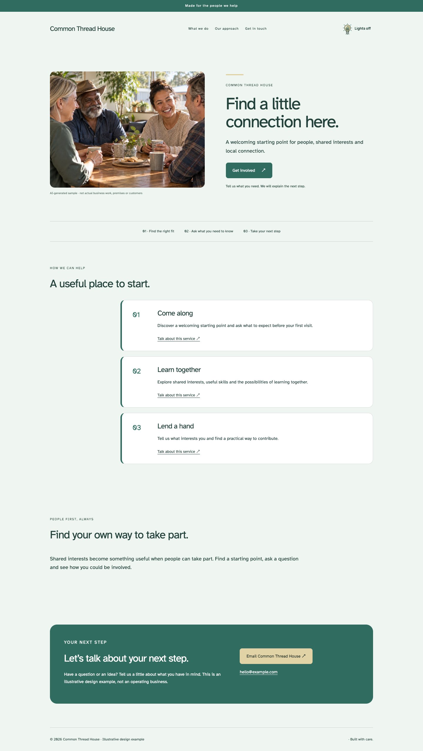
Friendly blue-green and cream support a reversed hero with people-focused photography. Stacked offers provide generous space for participation details and clear next steps. The layout uses readable sans typography and understated round corners, keeping the experience comfortable rather than childish. A wide introduction gives the organisation room to explain its purpose, with a restrained header and simple borders providing consistency throughout the page.
The thinking behind it
Stacked sections make longer practical information easier to follow and translate naturally to mobile. The photograph creates a human introduction without replacing useful details. This direction suits community or support services, provided images and wording represent real arrangements accurately and do not imply unverified accessibility, qualifications or outcomes.
A natural fit for: Community groups, Education programmes, Local support.
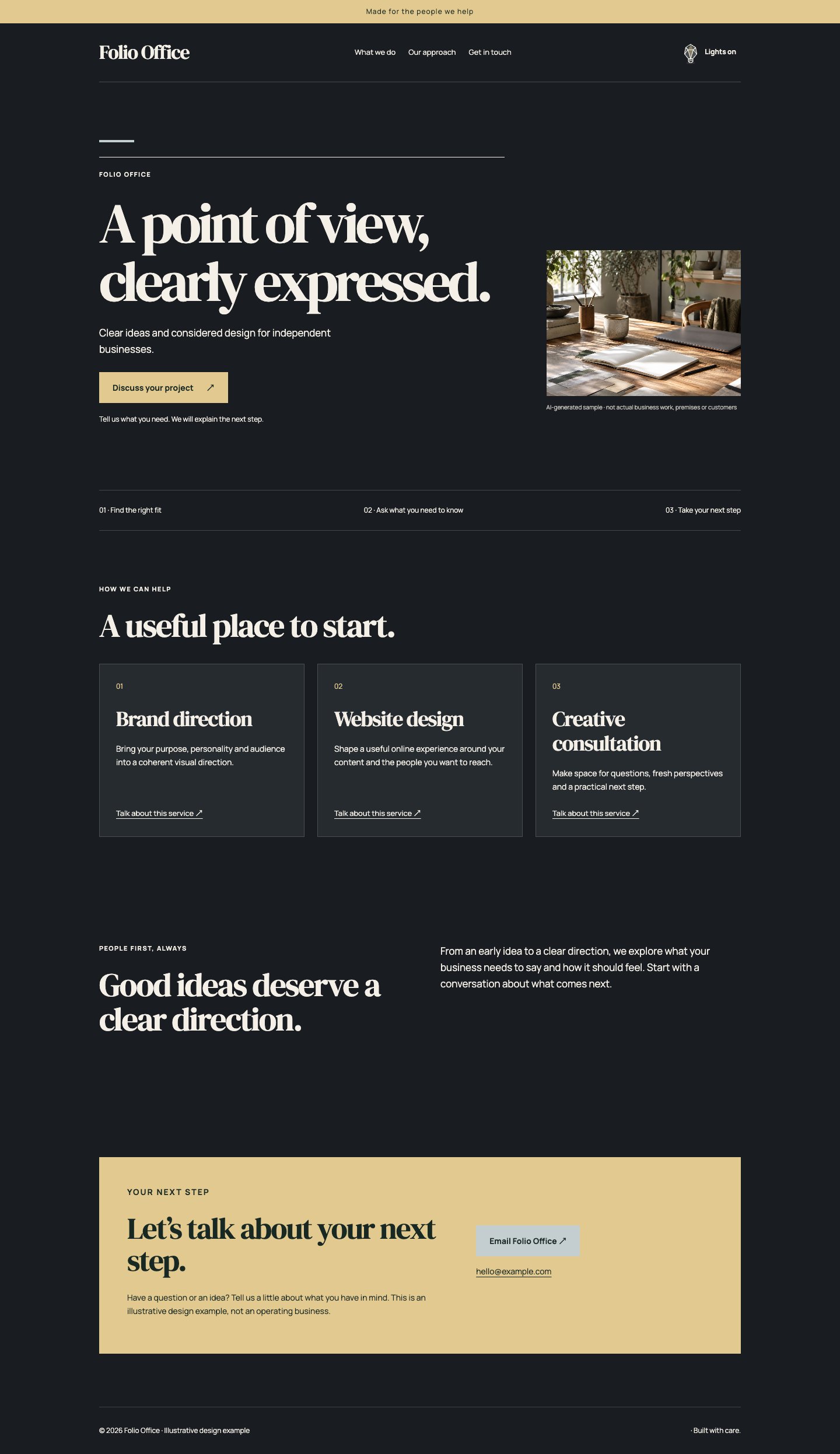
A large editorial headline sits above a generous image, allowing words and photography to share the opening in sequence. Warm black, ivory and a quiet ochre accent create a distinctive portfolio atmosphere. The service grid is simple and grounded, while a fine-ruled header recalls a carefully typeset publication. The overall effect is substantial and cultured, with ample space for a clear position and specific examples.
The thinking behind it
The headline-led structure lets a business establish its perspective before showing the work. Strong contrast and a restrained accent give photography room to breathe. It suits an articulate studio or specialist, but the opening sentence needs to say something specific; vague aspirational copy will feel disproportionately large.
A natural fit for: Creative directors, Photographers, Editorial studios.
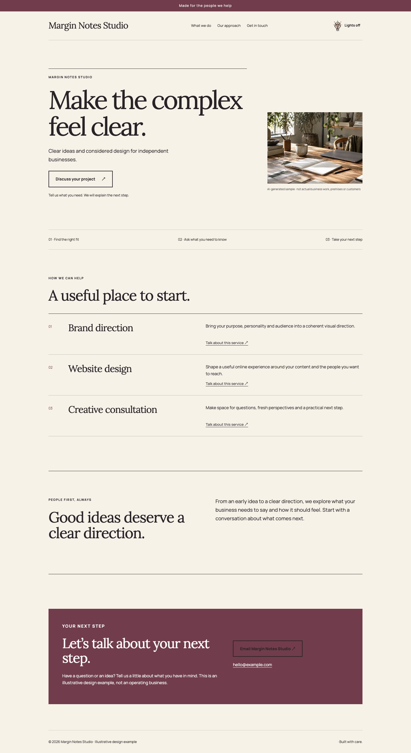
An oversized serif opening and wide photograph create the feeling of an independent journal. Cream paper, black ink and a restrained burgundy accent support a service list with generous horizontal rules. The introduction is treated as a bordered note, giving context a clear place on the page. This direction favours considered reading, useful explanations and distinctive writing over an abundance of decorative blocks.
The thinking behind it
A list keeps the hierarchy visible without forcing every service into an equal box. Serif headings create editorial character, while clear sans body copy supports longer explanations. It is a good fit for knowledge-led work; keep paragraphs purposeful and use genuine examples rather than letting the page become an essay.
A natural fit for: Writers, Consultants, Research-led studios.
A spacious editorial opening leads into column-based offers with a reference-book sensibility. Bone, slate and muted copper create a professional material palette, with substantial geometric headings balancing more detailed body copy. A wide introduction provides room for the approach behind the work. Rectangular photography, fine lines and a minimal header keep the composition precise, giving projects and processes a clear, ordered setting.
The thinking behind it
The column rhythm supports comparison and gives the page the character of a useful catalogue. Copper adds warmth without competing with project photography. This direction suits businesses that explain choices, materials or stages; use concise column headings and avoid cramming unrelated information into the same row.
A natural fit for: Architecture studios, Material specialists, Design consultants.
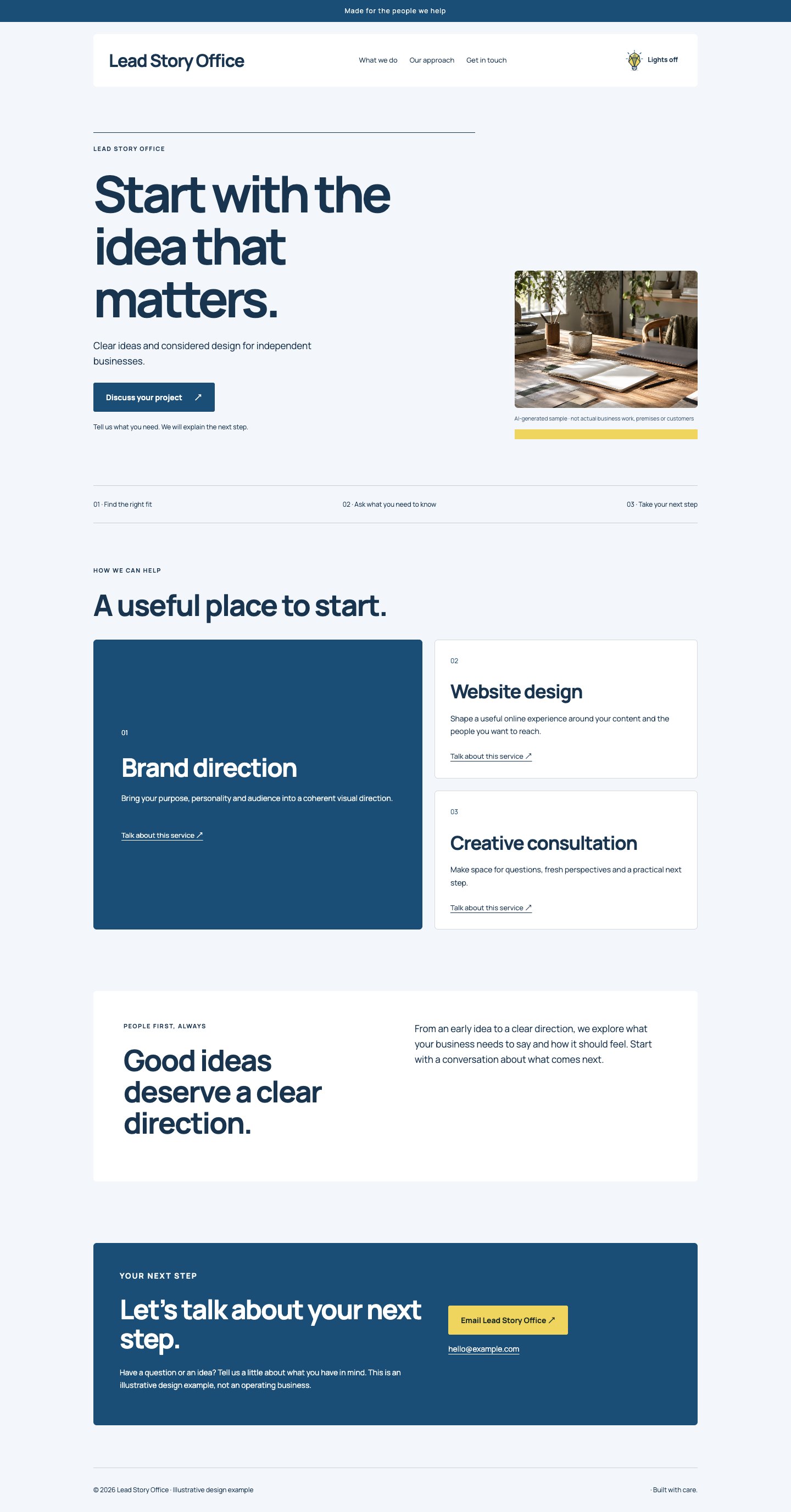
A headline-first editorial hero establishes a decisive opening, supported by a full-width photograph. Deep blue, bright white and a controlled yellow accent give the page a contemporary publication character. One featured offer continues the lead-story hierarchy before the secondary options. The about section sits in an inset panel, making the shift from services to background easy to recognise without adding unnecessary decoration.
The thinking behind it
The repeated lead-and-support hierarchy helps visitors see what matters most at both the opening and service section. Yellow draws attention to a deliberate action rather than every element. This approach suits a flagship service or product range; keep the lead offer genuinely central to the business.
A natural fit for: Brand studios, Product consultants, Specialist agencies.
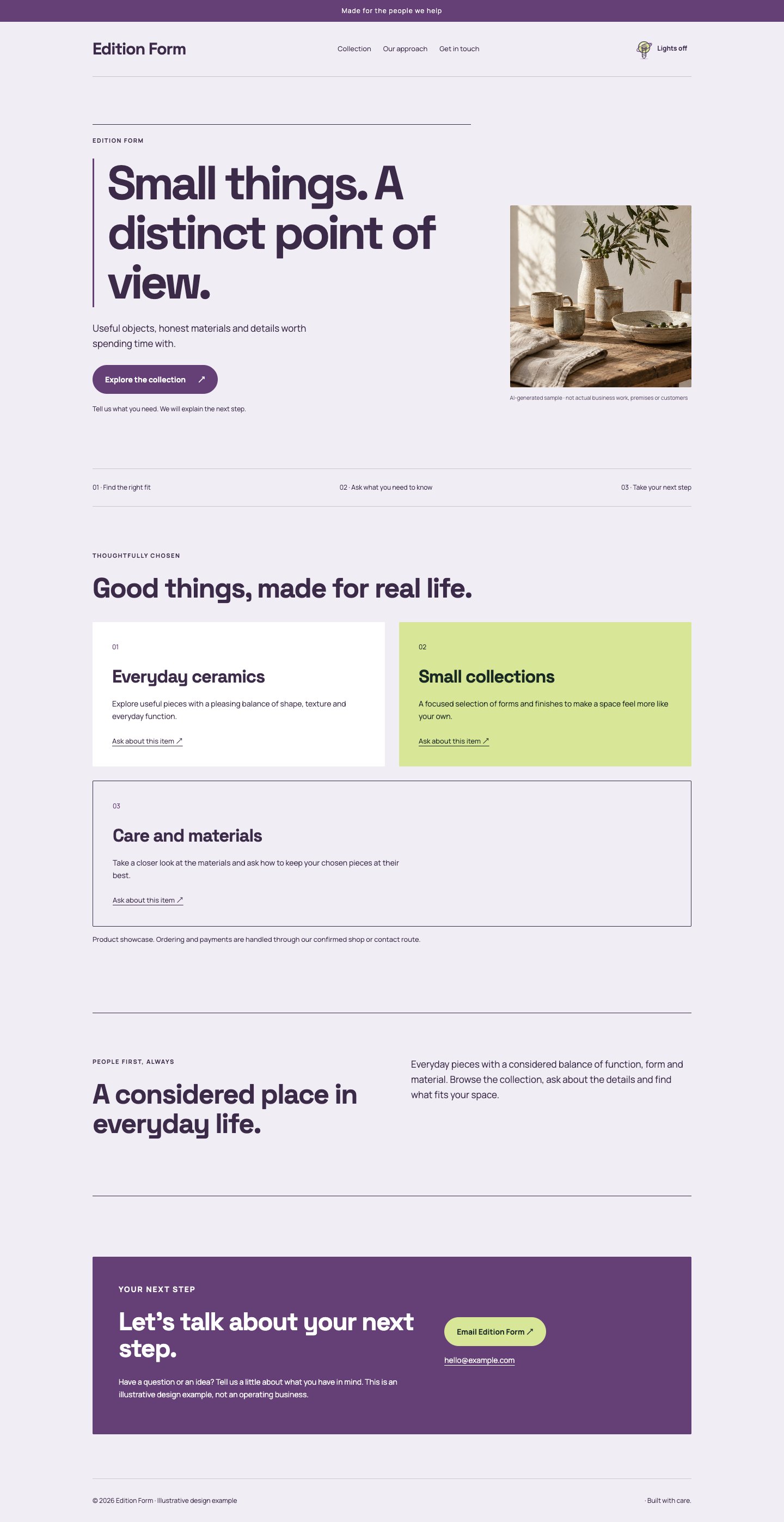
A bold editorial headline, wide image and a disciplined tile arrangement create an expressive studio catalogue. Pale lavender and white form a quiet base for aubergine ink and a fresh lime detail. The geometric type and squared tiles prevent the palette becoming sugary. A bordered introduction provides a pause in the page, allowing a varied collection or set of services to feel coherent and professionally edited.
The thinking behind it
An unusual palette creates distinction while repeated tile geometry maintains consistency. The contrast between organic photography and precise panels gives creative work an appealing frame. This is useful for a varied portfolio, but each tile should describe a real, distinct option rather than becoming another place for promotional filler.
A natural fit for: Creative studios, Independent makers, Design portfolios.
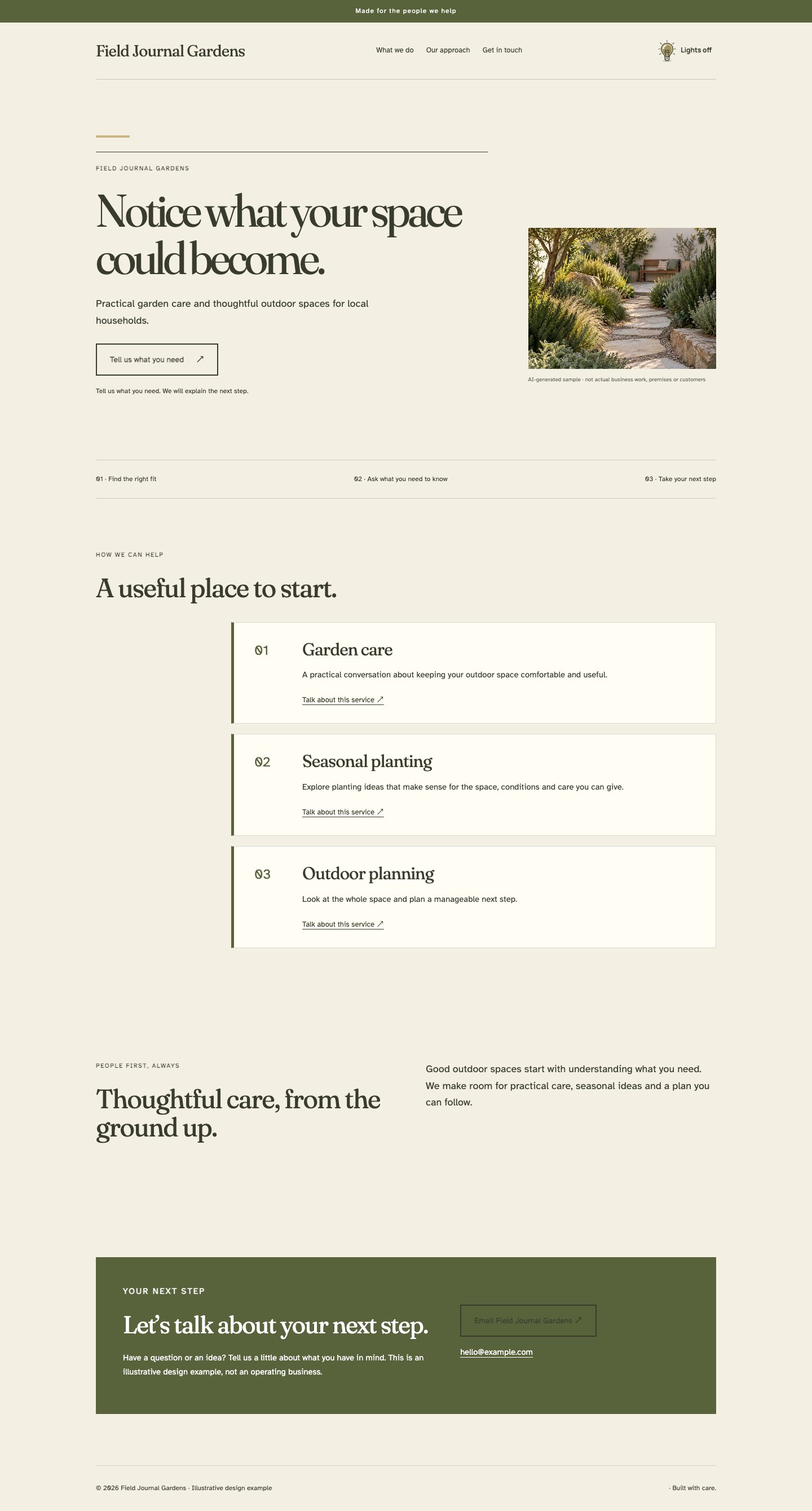
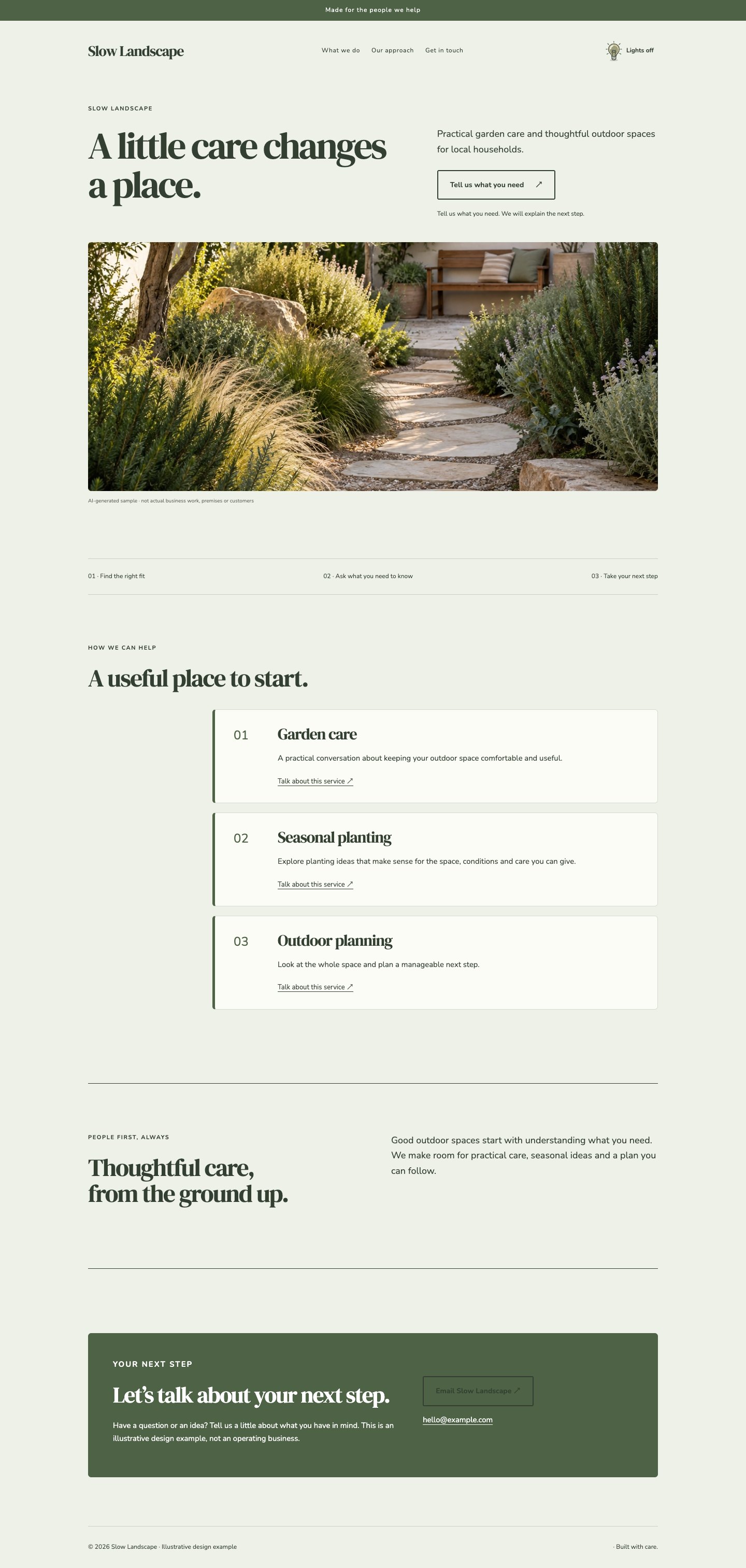
A quiet editorial opening combines a literary headline with a wide, natural photograph. Pale oat, moss and deep brown create a grounded journal-like character. Stacked offers accommodate practical explanations, while a split story section retains some visual movement lower on the page. Fine rules, square image treatment and readable body type make this a useful direction for landscape, craft and thoughtful place-based businesses.
The thinking behind it
The long-form rhythm lets a business explain how it works without making the page feel like a sales brochure. Natural tones support rather than overpower garden or material imagery. It is most effective when the copy contains specific observations, real processes and useful advice rather than generic descriptions of passion.
A natural fit for: Landscape practices, Natural craft, Place-based services.
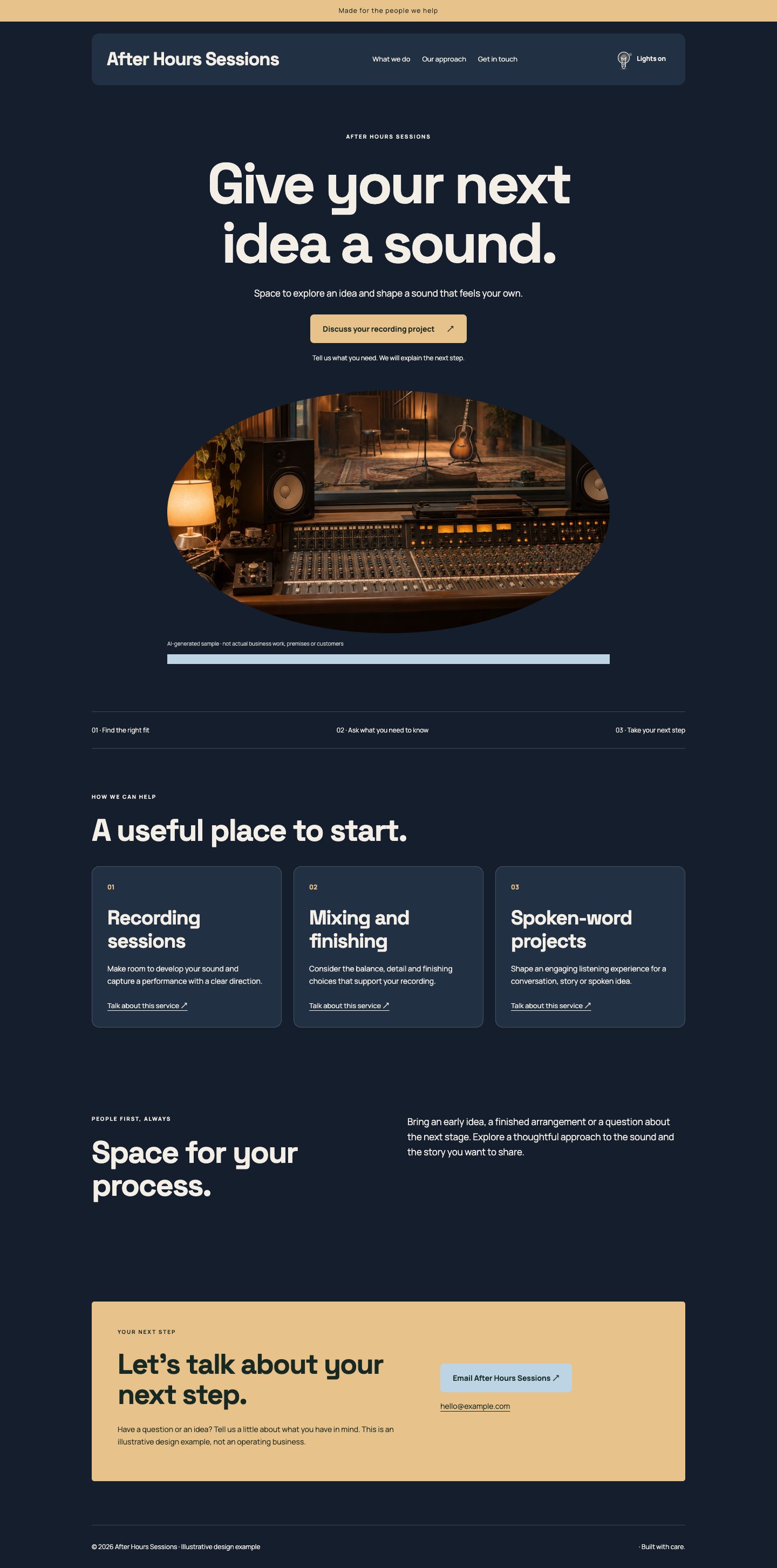
A centred poster-like opening uses a bold headline and a striking photograph to set the mood. Midnight blue, pale cream and warm amber give the page a contemporary studio atmosphere. The offer grid brings the design back to practical choices after the dramatic introduction. A banded header and rounded image treatment add structure, while concise copy and ample contrast keep the dark presentation easy to navigate.
The thinking behind it
The large centred statement creates a memorable first impression without requiring animation or a video download. Amber makes key actions easy to locate against dark surfaces. This direction suits recording, performance or evening venues; use a strong photograph and keep practical booking information as clear as the atmosphere.
A natural fit for: Recording studios, Creative venues, Musicians.
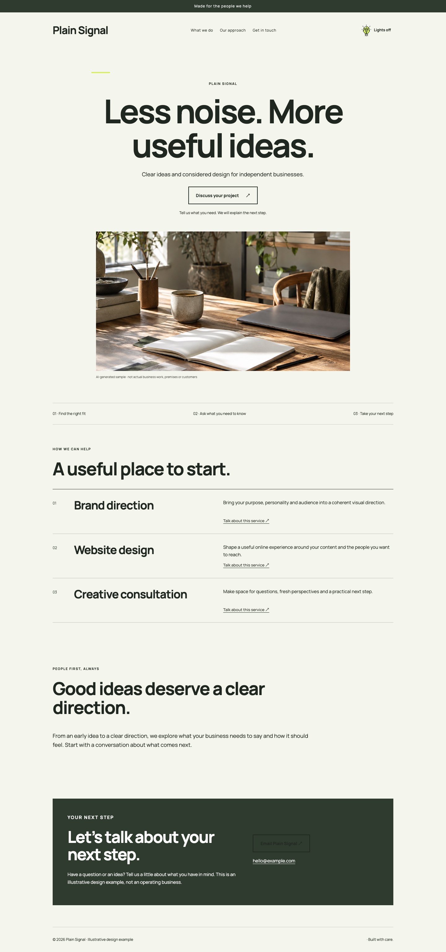
An oversized centred headline meets a spare monochrome layout with a vivid chartreuse accent. Services sit in a ruled list rather than decorative cards, making the page feel like a contemporary design poster with useful depth. The main photograph has a clean rectangular crop and the header remains minimal. A wide introduction allows the voice of the business to carry through beyond the striking first screen.
The thinking behind it
Chartreuse supplies energy while black and white maintain a controlled reading environment. The ruled list provides a clear counterweight to the large headline. This direction works for confident creative businesses with direct language; it loses its edge when every sentence is styled as another oversized announcement.
A natural fit for: Digital studios, Independent designers, Creative consultants.
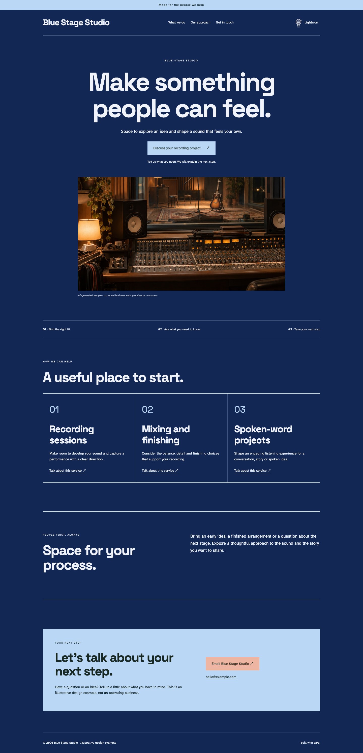
A deep blue canvas supports a centred display headline and a wide studio photograph. Column-based offers create a regular rhythm beneath the expressive opening, with pale blue and coral details separating action from atmosphere. Square edges and clear geometric type keep the page contemporary rather than theatrical. The story section uses a simple border, allowing the people and process behind the work to remain visible.
The thinking behind it
The dark colour field gives the page presence, while columns provide an orderly way to compare session or project options. Coral adds warmth without becoming the main event. Choose this for image-led creative work, and use real service detail so the striking visual treatment does not have to explain everything.
A natural fit for: Audio studios, Creative production, Performance services.
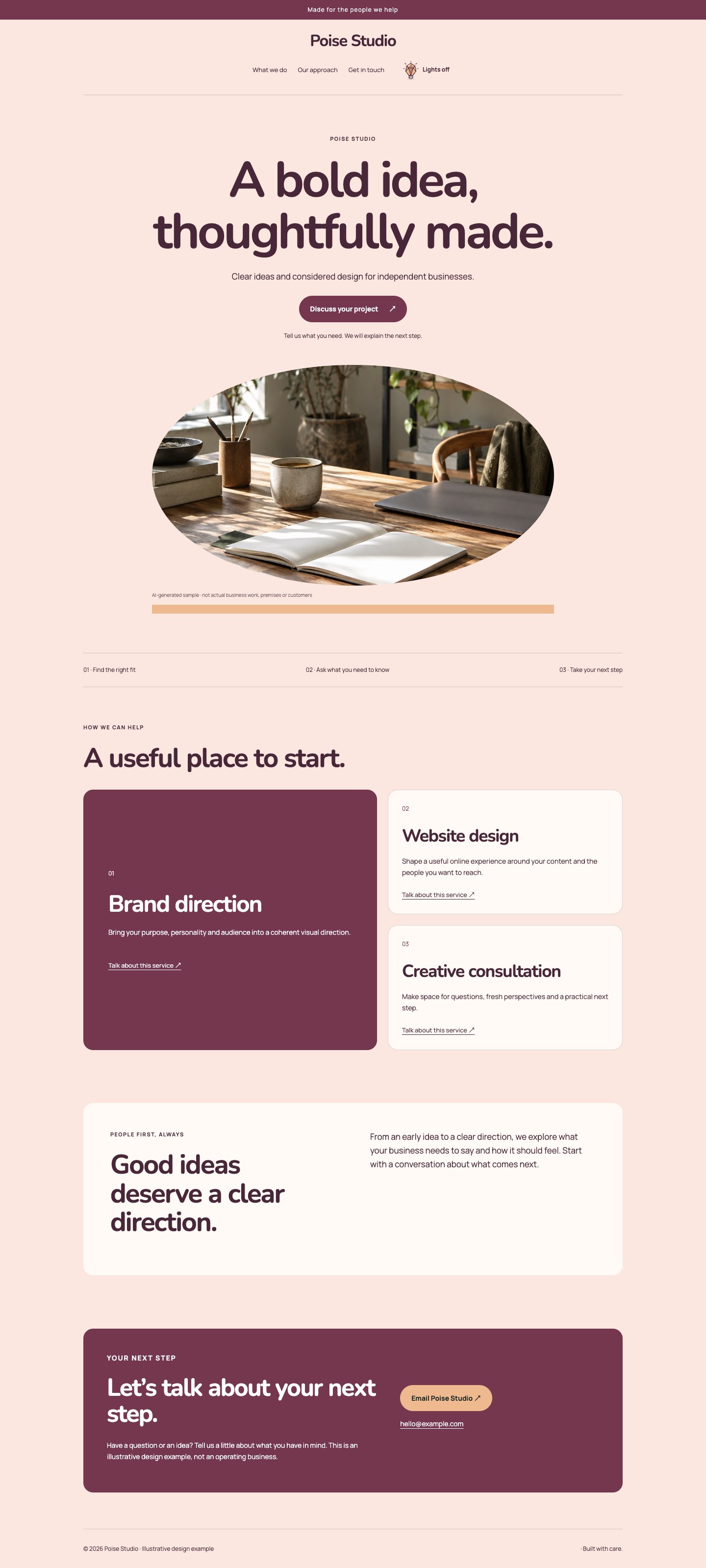
Coral paper, deep plum and creamy surfaces create a bold but carefully balanced studio direction. The centred poster opening uses rounded geometric type and an expansive photograph. One featured offer carries the strongest proposition, with supporting options arranged beneath it. A quiet inset story panel reduces the intensity lower on the page, giving the composition enough breathing room to feel designed rather than relentlessly loud.
The thinking behind it
The contrast between expressive colour and controlled hierarchy makes this direction lively without sacrificing usability. A featured offer helps visitors turn the initial energy into a concrete next step. It suits a distinctive creative service, but the palette should accompany confident work rather than compensate for missing content.
A natural fit for: Creative workshops, Brand studios, Independent services.
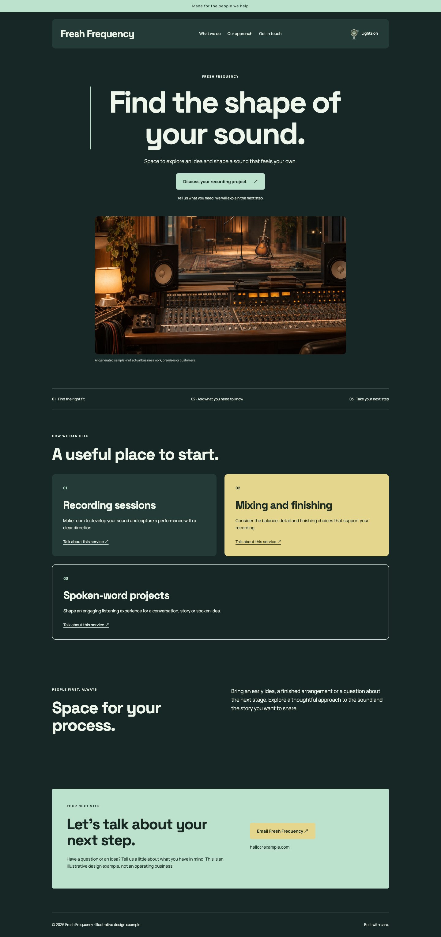
A near-black green base and crisp mint accent give a centred poster hero a contemporary creative character. Offer tiles provide a modular rhythm, while wide photography prevents the page from becoming an abstract collection of shapes. Large geometric headings and restrained rounded corners maintain a strong silhouette. The split introduction offers a calmer reading area, keeping the business story separate from the main service choices.
The thinking behind it
Mint highlights remain visible without the harshness of pure neon, and repeated tiles make different creative services easy to recognise. The page feels energetic even without motion. It is effective for audio and digital work, provided the photos are specific and the service titles do more than repeat fashionable buzzwords.
A natural fit for: Recording studios, Digital creatives, Production teams.
A centred, poster-scale headline leads into stacked service panels with unusually clear reading order. Bright ivory, deep navy and a warm yellow accent keep the boldness grounded and practical. The photograph is framed rather than decorated, and a wide about section allows useful context below the offers. This direction takes the confidence of a campaign page and applies it to an honest, straightforward service experience.
The thinking behind it
Large type gets attention, while stacked panels make the practical details hard to miss. The system is especially useful when visitors need explanations before enquiring. Its success depends on plain language and a specific headline; exaggerated claims will feel more conspicuous, not more credible, at this scale.
A natural fit for: Consultants, Local specialists, Service businesses.
A broad panoramic photograph establishes the setting before a clear, quietly confident introduction. Soft sand, deep sea blue and white create a spacious coastal character without resorting to nautical decoration. The offer grid helps visitors move from atmosphere to practical options. A wide story section and minimal header keep the page open, making this a strong direction for places whose surroundings are part of the experience.
The thinking behind it
Panoramic imagery communicates a sense of place quickly, while the following grid answers what a visitor can actually do. The restrained palette works with varied light and interiors. It needs a good wide photograph and accurate practical details; a generic stock scene will weaken the sense of a particular destination.
A natural fit for: Accommodation, Cafés, Local destinations.
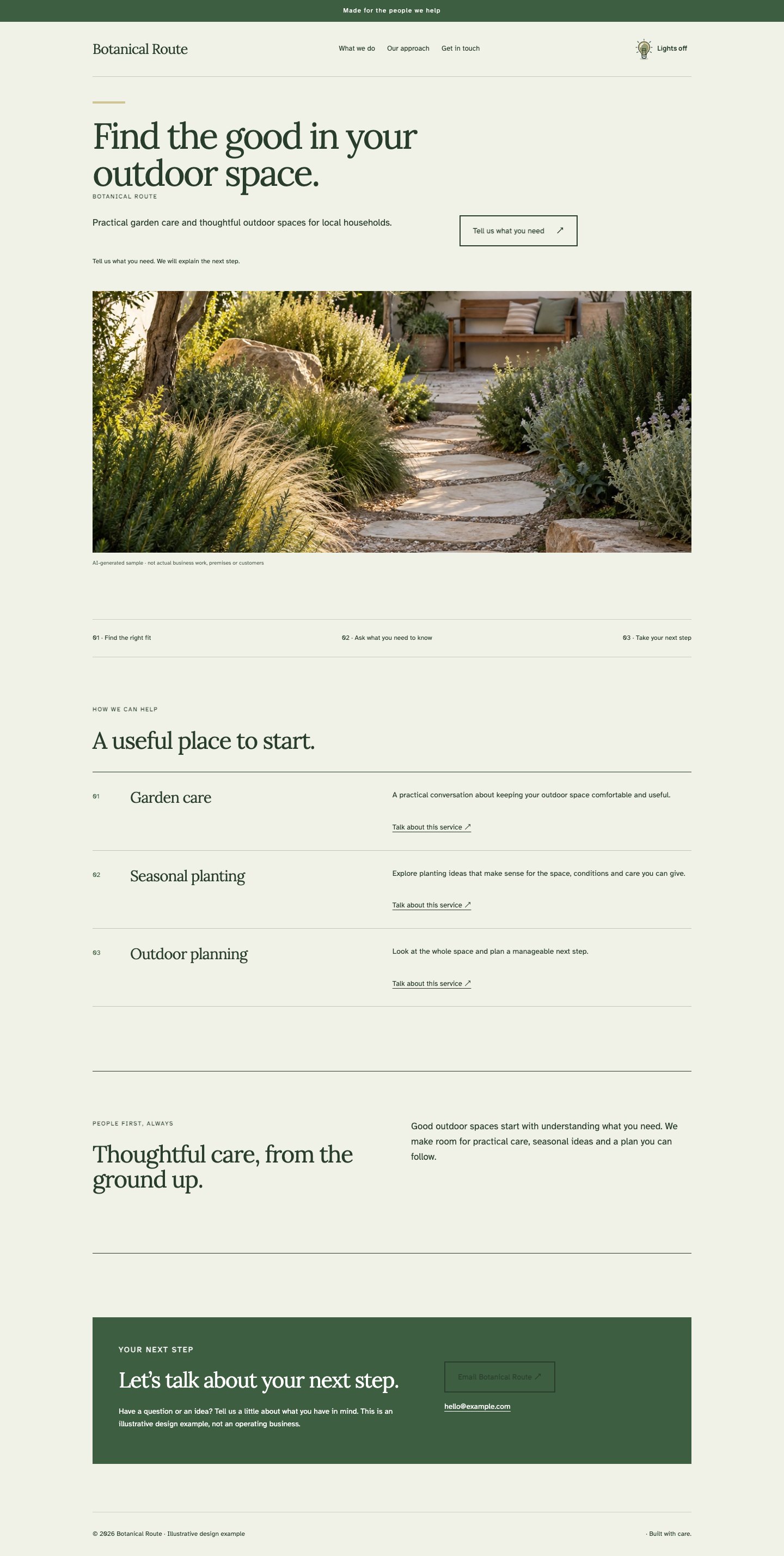
A wide garden photograph introduces an earthy green and chalk palette. A ruled offer list then gives the page a clear route from inspiration to practical help. The headline uses a warm serif, while body text remains straightforward and generous. A bordered introduction creates a place for approach and process, with fine rules and square images giving this nature-led direction a professional, composed finish.
The thinking behind it
The photograph conveys the desired feeling, and the list prevents the practical services from getting lost beneath it. Deep green supports readable contrast without making everything look like a decorative garden label. Use this when the work is grounded in real outdoor care, planning or environmental practice.
A natural fit for: Landscape services, Garden designers, Outdoor experiences.
A panoramic interior photograph takes the lead, followed by column-based services that feel like the chapters of a material tour. Pale stone, dark taupe and muted terracotta create a sophisticated but approachable palette. The type is modern and substantial, with plenty of breathing room. A split introduction, precise grid accents and an unobtrusive header support the architectural imagery without adding ornamental distractions.
The thinking behind it
The wide image establishes quality of space before the columns explain how the business helps create it. The material palette is warm enough for homes and restrained enough for professional work. This direction is strongest when photography shows relevant details and the copy explains scope rather than making unsupported quality claims.
A natural fit for: Interior practices, Joinery studios, Material suppliers.
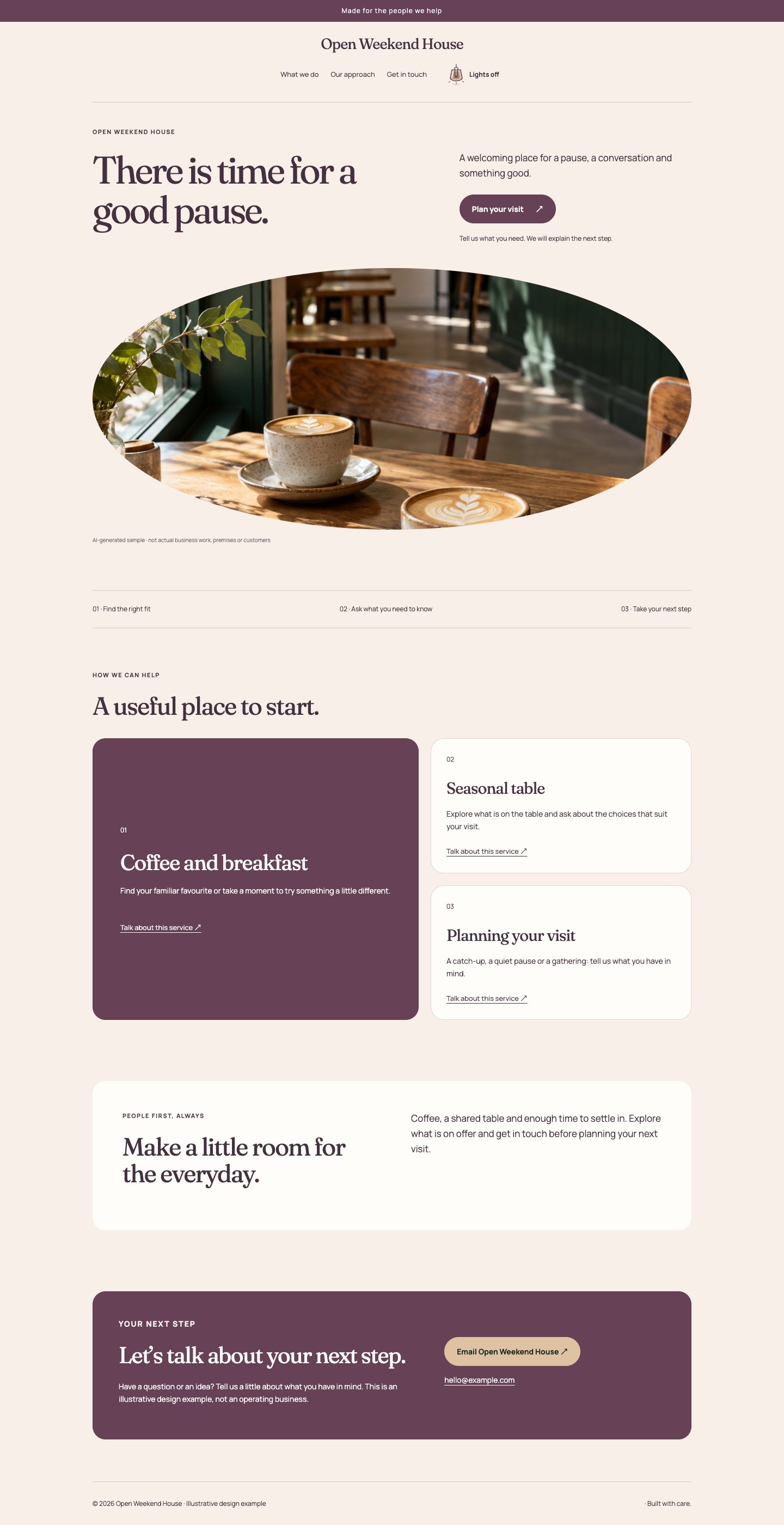
A wide, welcoming café photograph sits above a warm cream and plum composition. A featured offer makes the primary visit, booking or experience easy to identify before supporting choices appear. Rounded panels and a centred header add friendliness, while restrained typography keeps the presentation grown-up. The story section sits in a gentle inset, creating a comfortable pause between the offers and the contact invitation.
The thinking behind it
The design combines atmosphere with a strong first action, making it useful for visitors who want to know what to do next. Plum provides a distinctive alternative to standard hospitality brown. Keep the featured invitation current and factual, and make any actual booking conditions clear in the connected service.
A natural fit for: Cafés, Workshops, Local experiences.
A broad people-focused photograph introduces a fresh sky-blue and warm-white palette. Service tiles organise several ways to participate without forcing a single path on every visitor. Clear sans headings, modest rounded corners and comfortable spacing make the design friendly and easy to scan. A wide introduction explains the shared purpose, while understated outline details keep the visual system consistent across the different sections.
The thinking behind it
Tiles help visitors find the activity or support route that matches their situation, and the photograph introduces a sense of shared place. The palette feels open without relying on childish graphics. It works best when participation requirements, costs and access information are stated clearly and the pictured people are represented responsibly.
A natural fit for: Community spaces, Learning groups, Neighbourhood projects.
A panoramic garden scene sets a calm tone for a softly coloured, generous page. Stacked offers give practical explanations the space they need, with a literary headline and clear body copy establishing an unhurried rhythm. Pale sage, off-white and a deep earthy ink work together with very little ornament. A bordered story section adds enough definition to keep the spacious composition from feeling unfinished.
The thinking behind it
The combination of wide imagery and stacked text supports visitors who want to understand an approach before making contact. A restrained natural palette keeps attention on the work. This direction rewards specific, helpful content; the calm feeling comes from editing and spacing, not from removing the details customers actually need.
A natural fit for: Garden care, Landscape planning, Outdoor education.
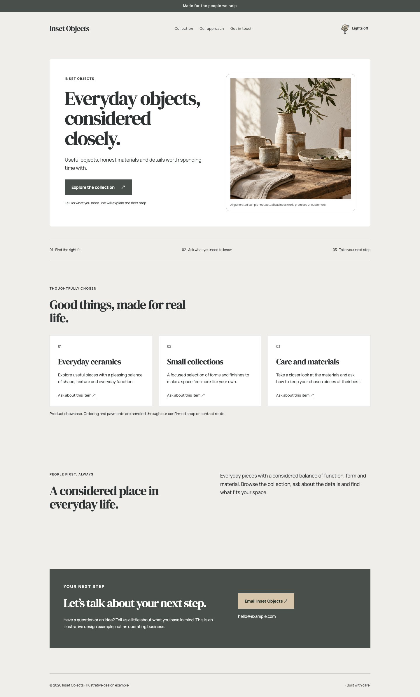
An inset hero places photograph and headline within a controlled frame, creating the atmosphere of a small contemporary gallery. Warm white, pale grey and deep charcoal let objects and material textures lead. A straightforward offer grid follows, supported by elegant serif headings and precise sans body copy. The restrained header and fine frame details make a focused collection feel carefully presented rather than surrounded by sales decoration.
The thinking behind it
The inset composition makes the opening feel intentional and helps mixed imagery share a common frame. Neutral surfaces keep attention on the objects. This direction suits a small curated range, but it remains a presentation layer; real orders, stock, delivery details and checkout still need the appropriate shop connection.
A natural fit for: Object makers, Ceramics, Curated collections.
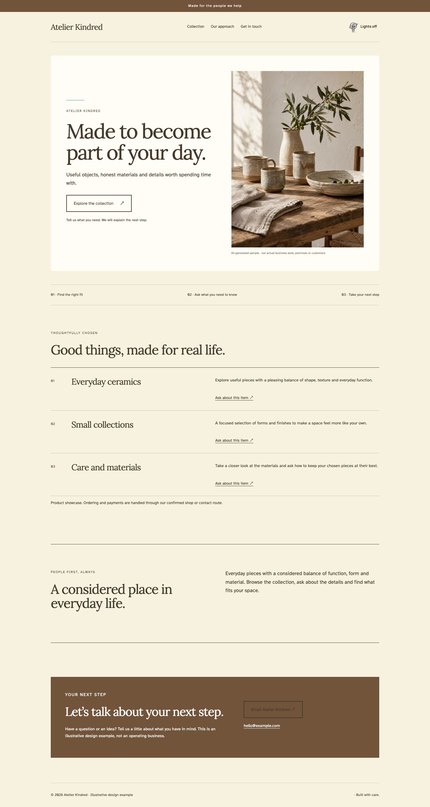
A softly framed opening combines a portrait photograph with a characterful serif headline. Butter cream, tobacco brown and a pale blue accent lend the page a distinctive atelier mood. A ruled list presents collections or commissions with the clarity of a small printed catalogue. The introduction uses a simple border, leaving the maker room to explain materials and process without adding unnecessary decorative flourishes.
The thinking behind it
Portrait imagery and a list structure feel personal while remaining easy to browse. The small blue accent prevents the warm palette from becoming overly nostalgic. It is a good choice for limited collections or commission-based work, especially when the maker can provide useful details about materials, care and ordering.
A natural fit for: Independent makers, Commission artists, Craft studios.
A clean inset hero introduces a modern catalogue with column-based offers and confident geometric type. Cool cream, ink blue and a fresh peach accent create a useful, approachable commercial identity. Square photography and visible grid structure make different ranges feel related. A wide introduction provides a place for the business’s approach, keeping the page focused on clear choices rather than a dense wall of promotional badges.
The thinking behind it
The regular columns make it easy to compare ranges and keep a growing catalogue visually coherent. Peach warms the otherwise precise blue palette. This direction is effective for a focused product business; once the range becomes large, pair the presentation with proper category navigation and a functioning commerce system.
A natural fit for: Focused shops, Design products, Small suppliers.
An inset photographic opening and a rich olive palette give this collection direction a poised, material character. A featured offer places the signature range or service ahead of supporting options. The headline uses a generous serif, while the rest of the interface stays clean and direct. An inset story panel reinforces the carefully framed composition without distracting from the object photography or the practical route to an enquiry.
The thinking behind it
A featured collection helps a visitor understand the business’s point of view quickly. Olive and warm ivory complement ceramics, timber and natural fibres without competing with them. Use the lead space for a genuinely representative collection, and make the difference between a showcase and a purchasable product clear.
A natural fit for: Furniture makers, Ceramic collections, Bespoke craft.
A rounded inset hero introduces a soft blush and dark berry palette. Tile-based offers give collections, services or buying guides a recognisable place, while friendly geometric headings keep the page contemporary. Photographs retain clear boundaries and ample breathing room. The split introduction adds a human story below the choices, creating a welcoming presentation that can sit comfortably beside a properly configured shop or enquiry flow.
The thinking behind it
Tiles provide the familiar rhythm of browsing a collection without requiring crowded product shelves. Berry actions are easy to identify against the light background. It suits a small lifestyle range, but visual friendliness must be matched with accurate prices, available options, delivery information and a real ordering route.
A natural fit for: Lifestyle makers, Boutique collections, Creative products.
An inset, square-edged hero and stacked offer panels give this direction the clarity of a well-designed product file. Cool grey, white and dark graphite keep the presentation understated, with a muted tan accent adding warmth. Readable typography and a wide introduction leave room for materials, process and care details. The result is practical and composed, especially for objects whose value benefits from a little explanation.
The thinking behind it
Stacked panels support useful details without forcing them into narrow cards. A restrained palette lets different product photographs coexist comfortably. This direction works for careful buyers who want substance before making contact; replace generic descriptive phrases with real dimensions, materials, options and terms wherever those details are available.
A natural fit for: Furniture, Functional objects, Specialist makers.
An offset hero gives the photograph and headline different visual weights without losing their relationship. Chalk, charcoal and dusty rose form a restrained contemporary palette. A regular offer grid provides a stable contrast to the opening, while a split introduction continues the composition’s gentle movement. Serif display type and square images add sophistication, making the direction distinctive through proportion rather than an excess of graphic effects.
The thinking behind it
Asymmetry creates interest, and the regular grid below keeps the whole page easy to navigate. The muted palette allows the layout itself to carry the character. It is well suited to a studio with strong visual work; keep the headline focused so the uneven proportions continue to feel deliberate.
A natural fit for: Design studios, Interiors, Creative consultants.
An offset headline and photograph give a familiar consultancy page a more distinctive silhouette. Cool white, dark ink and a cobalt detail keep the system crisp. A ruled offer list introduces services in a clear sequence, followed by a bordered approach section. Geometric type, minimal navigation and fine grid accents create a professional setting for work that is analytical, creative or a little of both.
The thinking behind it
The unexpected opening earns attention while the list supplies a familiar way to compare services. Cobalt creates a recognisable action colour without colouring every surface. This direction suits independent professional work, but benefits from specific examples and clear scope so its confident appearance is supported by useful information.
A natural fit for: Consultants, Digital studios, Independent specialists.
An offset opening pairs architectural photography with confident modern typography. Warm bone, deep rust and muted sand make the palette feel grounded rather than clinical. Column-based offers echo a carefully arranged interior, with a wide introduction giving the business room to explain its approach. Square corners, restrained block accents and a quiet header keep the composition modern while the colour and imagery provide the warmth.
The thinking behind it
The column rhythm supplies order and the rust accent gives the page a memorable identity. Asymmetry makes material photography feel curated instead of simply placed beside text. It suits architecture and skilled craft, especially when the images show real details and the copy makes the practical process easy to understand.
A natural fit for: Interiors, Cabinet makers, Architectural services.
An offset hero balances a large image with a calm, substantial headline. Pale blue-grey, white and a deep mineral blue create a polished studio identity. A featured offer gives the page a clear centre of gravity, while an inset introduction provides a quieter reading moment. Rounded rectangular imagery and restrained outline details soften the architectural structure without losing the clean, contemporary character.
The thinking behind it
The featured offer turns a visually expressive opening into a clear practical choice. Cool neutrals work with a wide range of photography and keep coloured accents purposeful. This direction suits a focused studio or service business; the leading offer should be representative, while supporting options remain easy to find.
A natural fit for: Creative studios, Photography services, Professional practices.
An offset photograph and bold geometric headline create a contemporary opening with a little visual tension. Pale lilac, dark indigo and warm melon give the page a distinctive but controlled palette. Offer tiles organise several creative services, while a bordered introduction gives the underlying approach a separate place. The design uses precise square edges and thoughtful spacing, allowing the unusual colour combination to feel intentional and mature.
The thinking behind it
Tiles keep varied services connected, while asymmetry gives the page a more individual silhouette. Warm melon prevents the cool palette becoming remote. Choose this for a creative business with several related offers, and make those relationships clear in the copy so the visual variety does not become confusion.
A natural fit for: Brand studios, Digital creatives, Multidisciplinary makers.
An offset editorial opening combines a generous serif headline with a tall image, followed by spacious stacked offers. Dark chocolate, warm ivory and soft brass give the page a composed, quietly luxurious character. A wide story section supports more considered reading, while minimal navigation and fine rules keep the experience clear. The visual impact comes from proportion, contrast and careful pacing rather than decorative flourishes.
The thinking behind it
Tall photography and a large serif headline create presence, while stacked offers leave room for useful explanation. Brass is used as a supporting note rather than a claim of prestige. This direction works for thoughtful specialist services, provided the detail and quality of the actual work match the composed presentation.
A natural fit for: Specialist studios, Interior services, Bespoke makers.
No directions match yet. Try a broader word or clear your filters.
A STARTING LOOK, NEVER A STRAITJACKET
Change your mind. Keep your work.
Start with a direction and make it your own. In the studio you can build up to eight pages, keep your colours and fonts when you switch, or give just one page or section a different feel. Save a restore point whenever you want to keep a version.
Screenshots show fictional example businesses and illustrative imagery. Names are examples, not recommendations or name-clearance checks. The previews are pictures of the actual layouts; they are not interactive shops or booking services. Studio access follows your membership’s current availability.
Need a hand?
Let’s find your next step.
Practical help, one thing at a time.
Start with the page’s instructions, save a copy of your work and try one change at a time. Our tool tour explains the main tools.
Prefer a person?Draft an email for help Your email app opens a draft for you to review and send. Don’t include passwords, payment information or private customer records.